As anyone who has a regular art practice knows, learning from those gone before you is as critical as the amount of time you spend drawing. So, when the Australian Society of Authors advertised an online workshop with Australian picture book legend, Ann James, I jumped at the chance.
I never go into these webinars thinking I’m going to come away with a million bits of gold dust that will instantly make me a supercharged performer. In any workshop I participate in, I’m looking for one thing (maybe two) that I can carry with me as I evolve as an artist. Curiously, in this one by Anne James, it wasn’t necessarily her personal advice that struck a chord. It was an anecdote she shared; some sage advice from another illustration great, a friend of hers, Leigh Hobbs. He said,
You’ve got to let the line breathe.
Ahhh. Feels nice already, doesn’t it? One year on, I’m still thinking about this idea, so I thought I’d write some notes to my future self (with some reference pictures) to remind me of what on earth this means.

Breathe in…
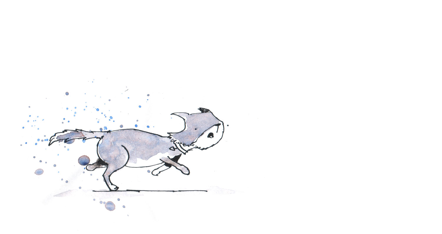
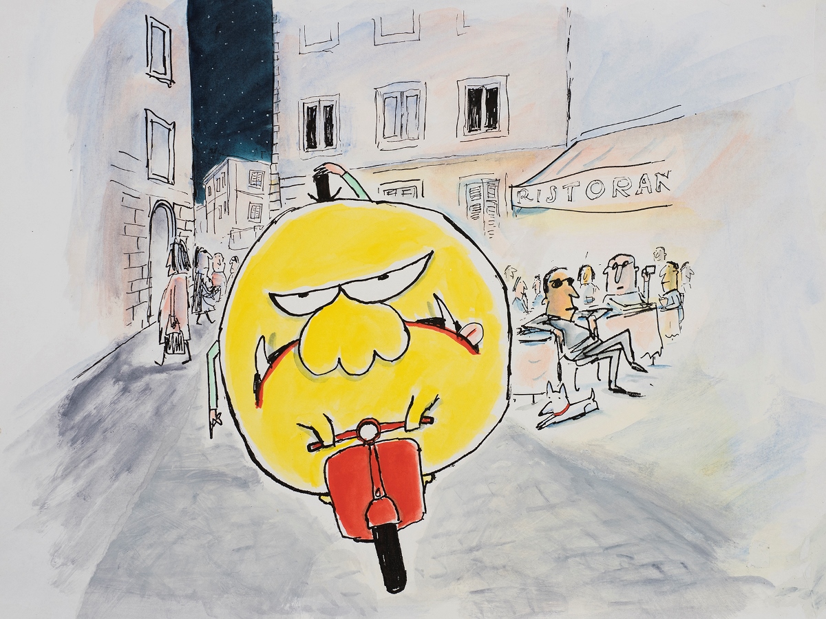
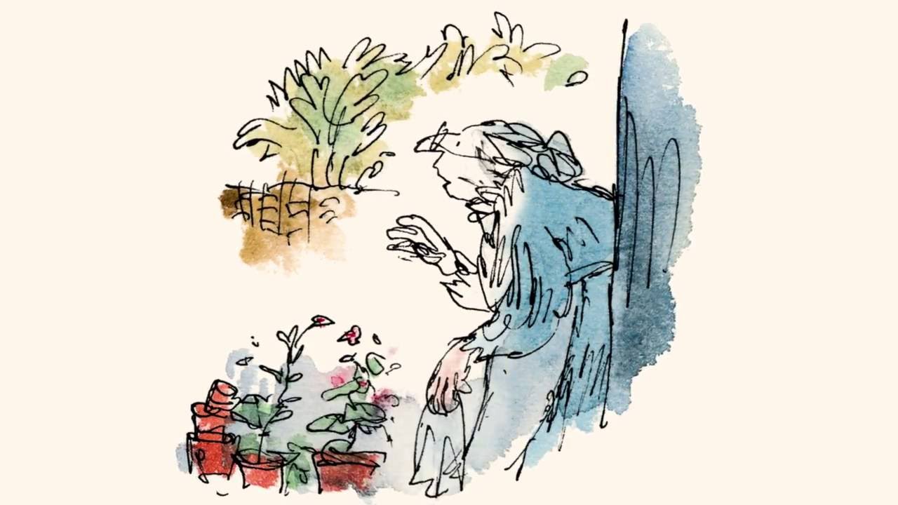
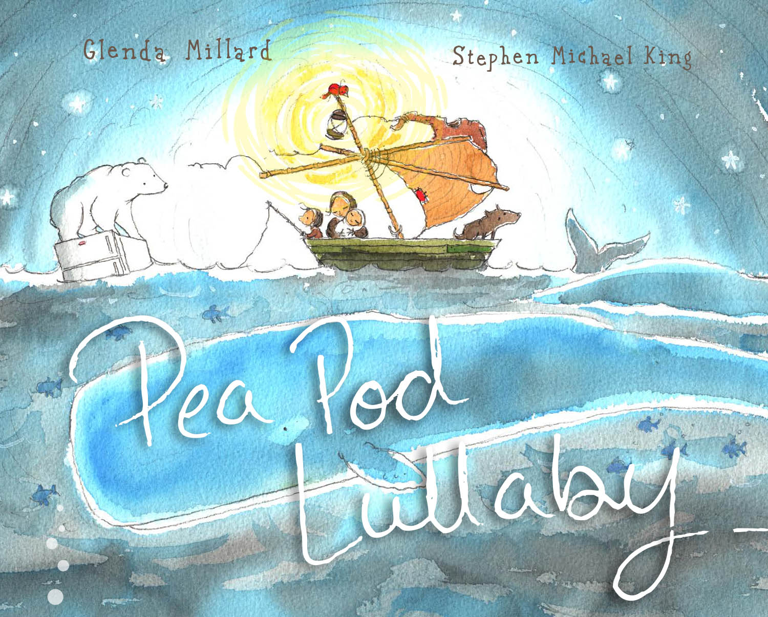
What Leigh was talking about was related to the bold, striking style we so dearly associate with him – pen and wash. See, as it turns out when you’re adding watercolour wash to your pen work, you’ve got a choice about how precisely you ‘colour in’ your lines. You can choose to bring your colour riiiight up close to the line, so it touches it, or, you can bring your wash near (but not touching) the line. The latter is what Leigh means by ‘breathing room’. It’s the space that an illustrator chooses to leave between the wash and the line that has some exciting characteristics.
Why bother thinking about this? I’m glad you asked. You know that saying, less is more? Well, the less you colour in, the more you leave open to the viewer to fill in the blanks. This means you’re producing a more fulfilling experience for the viewer and doing less work in the process. Any way you look at it, it’s a win. Here’s what happens.
Increase energy and movement in your illustration
Even if you’ve got a really expressive line (think width, shape, brokenness), giving that line some ‘breathing room’ lets the pen and wash work together to ‘jiggle’ the image. It gives it motion. The space you leave is filled in by the viewer, their eyes move back and forward as they try to close the gap themselves. Whether they realise it or not, it’s exciting.

Provide a stronger indication of light
The best way to paint light is to paint only the shadows. By leaving some whitespace between the line and the colour, the viewer will read it as the brightest part of the image. They just cannot avoid this. It’s a bit like magic. You can simply suggest the colour of the surface, and the viewer does the rest.

Extend an invitation to interpret
If you have a pen and wash image that’s a little claustrophobic (coloured all the way up to the lines), there’s less to intrigue the viewer. They can see the line, and the colour you’ve applied, and so it’s read as a complete, finalised shape. By giving the line a bit of breathing room, there’s SO much more for the reader to interrogate. They can question what the true colour of the object is. They can read the light source. The angles between the pen and the shape of the wash can indicate contour. It merely makes each image slightly more interesting, and, well, fun.

Reveal the human behind the work
A picture book on a shelf in a bookstore is pretty perfect. It’s nicely finished. Perfectly bound. If you buy one, you’re expecting ‘quality’ for your money. But, as humans, we’re drawn to imperfection. No one is perfect, and for some reason, we like to see other humans being imperfect too. So, while we want our picture books not to fall apart the second we buy them, a breath in an image helps the reader imagine the artist who made the contents. They imagine the process by which a human put brush and ink to the page. They probably imagine someone sitting at their crafty desk, surrounded by all of their beautiful art supplies. It’s an endearing and highly sought after job after all. It prompts them to question things, too. Why did the artist not ‘finish’ colouring in? Was it a mistake? Was it intentional? The questions increase engagement and participation, which, in the end, is what being an artist is about.
Breathe out
Letting the line breathe is a beautiful piece of advice and not one I see anywhere on the internet when ‘pen and wash’ is discussed. The technique is rife in some of our most accomplished illustrators. When you start looking for it, it’s everywhere.
