
After 5 or so years of painting with watercolour, I’ve spent A LOT of money on paint. Some have been a brilliant investment, while others sit in the draw. There are some tubes that have only a few millilitres used and I’m unlikely to go to them any time soon. The problem is, I love colour, it’s seductive and exciting. I rarely leave a trip to the art store without another tube to try. But when it comes to watercolour paints, I’ve finally settled on a core set that’s great for my two main purposes: work in picture books and painting outdoors (also known as en-plein air painting).
Because colour is literally infinite, it’s important to be clear on why a colour is “in” and “out”. The ins and outs reasons described here are very personal and it’s likely that everyone will value different things in their paints. Here’s why these are the ones I trust:
- For what I paint, I can make close to any colour with these 11 pigments
- The mixes of each produce very reliable effects
- They are all single pigment paints which helps provide luminosity to the work
- They are ALL extremely lightfast which means if I sell anything, the buyer gets something that will last for a long time.
Here are the colours mapped on to the colour wheel
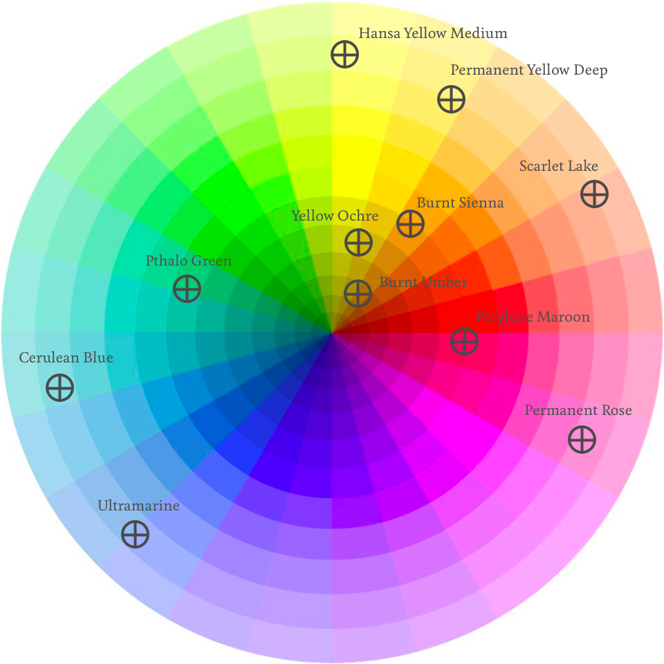
Hansa Yellow Medium (PY97)
In summary: A bright versatile mid yellow. It mixes beautifully with a whole range of blues and reds.
There’s not really that much to say about this pigment except it’s a nice primary yellow and because of this, very versatile. You can make some beautiful oranges if you mix it with reds and VERY bright greens if you mix it with the right blue. On its own, it’s perfect for bright sunny days.
Permanent Yellow Deep (PY110)
In summary: When it’s diluted, it’s a sunnyside up egg yolk. But when it’s thick and buttery, it’s the dark yellow/orange of a hard-boiled egg yolk
BOY did I fuss over getting this one nailed down. It was actually one of the first pigments I ever bought but I spent so much time messing around with ‘orange’. I tried Pyrolle Orange, but it just doesn’t mix as cleanly with some of the other colours I have. I also tried Nickel Azo Yellow, which is duller, and, well, just ‘less orange’. Nickel Azo is still one of my favourite colours, but in terms of a flexible colour palette, nothing goes past Permanent Yellow Deep. New Gamboge came close but I like to stick with single pigments, and New Gamboge is a mix between two different ones.
Good alternatives depending on your needs are things called: New Gamboge, Nickel Azo, Pyroll Orange
Scarlet Lake (PR188) by Windsor and Newton
In summary: I inititally found it difficult to like this colour, until I learned how to use it.
Scarlet Lake was in my first watercolour set but it never looked ‘red’ enough for me. It loses a lot of saturation as it dries. I went out on a limb and bought a Pyrolle Red to see if that changed my opinion. And, well, Pyrolle Red is gorgeous, it’s perfect fire truck red, but I just couldn’t get the luminosity in my mixing in the way I can with Scarlet Lake.
Permanent Rose (PV19) by Daniel Smith
In summary: My pet name for this colour is ‘blush’. It’s perfect for pink cheeks.
Ok, so technically this isn’t red, but by golly isn’t a gorgeous pigment. Mix it with a dash of yellow ochre for a lovely skin tone, or let it mingle with ultramarine for a perfect purple. I don’t carry a purple pigment because it’s too much fun seeing how Permanent Rose and Ultramarine make magic on the paper together.
Ultramarine (PB29) by Daniel Smith
In summary: The most versatile and used paint in my palette.
Yikes, this colour deserves it’s own post! It’s by far the most useful colour for anyone, ever in watercolour. No matter which other blog or site you look at, this will be an absolute staple in every person’s palette. In fact, you could literally run with this blue and no other if you really wanted to, it’s that good.
Cerulean Blue (PB36) by Holbein
In summary: Most useful for skies. It’s a sunny blue that’s also great for shadows in white clothing.
No matter how many cool blues I try, nothing gets me quite as much as this Cerulean by Holbein. It’s the only Holbein I carry and I dare say that if I was painting more natural landscapes, a Cerulean Chromium from Daniel Smith or Manganese Blue Hue from Daniel Smith would suit better. But when it comes to painting summer skies for picture books, Cerulean is my go to.
Pthalo Green (PG7) by Daniel Smith
In summary: I use this VERY rarely, mainly when I’m lazy. It makes the blackest black when you mix it with it’s exact complement, PR179
I don’t really need Pthalo Green, but I keep it on my palette anyway, for when I’m lazy. Even without it, I’m confident now that I can mix any green I need. But, it’s got this secret magical power. When you mix it with Perylene Maroon (it’s exact complementary (opposite) colour) you get the blackest black you’re ever likely to be able to find. I don’t often like mixing black (or using it at all) but sometimes, on very special occassions, it’s nice to be able to make it when you need it.
Perylene Maroon (PR179) by Daniel Smith
In summary: Most people use Alizarin Crimson, but this alternative is so much more lightfast
There’s probably only one place on the internet where the recommendation is to avoid Alizarin Crimson. EVERYONE still uses it, well, at least they say they do. But Bruce McEvoy of Handprint recommends giving Perry (my pet name for this pigment) a try and I’m so glad I did. It’s quite simply luscious. If you need red velvet curtains? Ask Perry. If you need the blackest black you can ever make, introduce Perry to Pthalo Green. It’s not an everyday pigment for me in the book illustration work that I do, but for landscapes, it’s a delight to work with.
Earths: Yellow Ochre (PY43) by Windsor and Newton, Burnt Sienna (PR101) by Daniel Smith, Burnt Umber (Pbr7) by Daniel Smith
In summary: PY43 is technically not ‘real’ yellow ochre but who cares right? For PR101, if I’m painting landscapes, I use the less orange alternative PBr7. My Burnt Umber is a most delicious brown. It’s like painting with chocolate.
Whilst I can get pretty close to hitting these colours with certain mixes from the others, I find the earth triad really just so pleasurable to work with. Everything from sandy beaches to the dusty red Australian soil, the combination of these three workhorses bring me an instant pleasure. And isn’t that what painting is supposed to be about?
And that’s it…
Well, I’m always experimenting with different pigments but they’re really expensive and so to save money, the best thing to do is learn how to colour mix properly. There are other pigments I use for special occassions of course, like Indanthrone Blue when I need a nice pure navy, or Manganese Blue Hue for meditteranean waters. But overall, there’s a reason ‘split primary’ is a well-known colour setup. So, now I’m off to do some mixing.