Having completed my first five-metre mural on glass, I wanted to share this little how-to guide to help other artist and illustrators shortcut the process if they ever want to try this themselves. At the time, I found it very difficult to piece together disparate pieces of information across the internet on how to do this to a professional level, but in the end, it turned out OK. So, here it is.
Drawing skills
This guide doesn’t cover drawing skills. I’m assuming that if you’re trying this, you’re at least confident in your drawing style. No matter how specific I can be about the application of paint on glass, nothing will make up for a wonky-looking drawing. How do you get better at drawing? Well, draw. Lots.
Materials
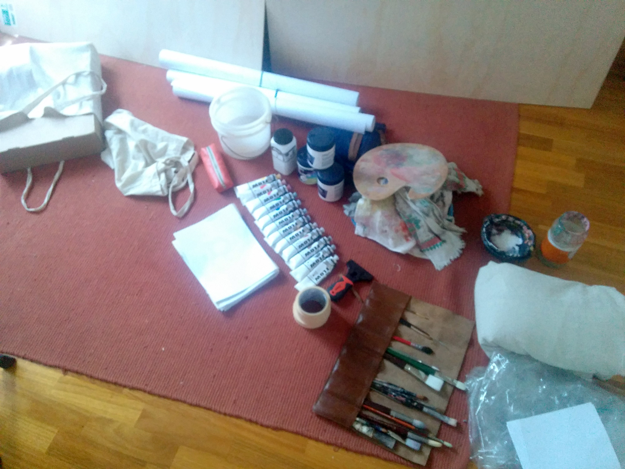
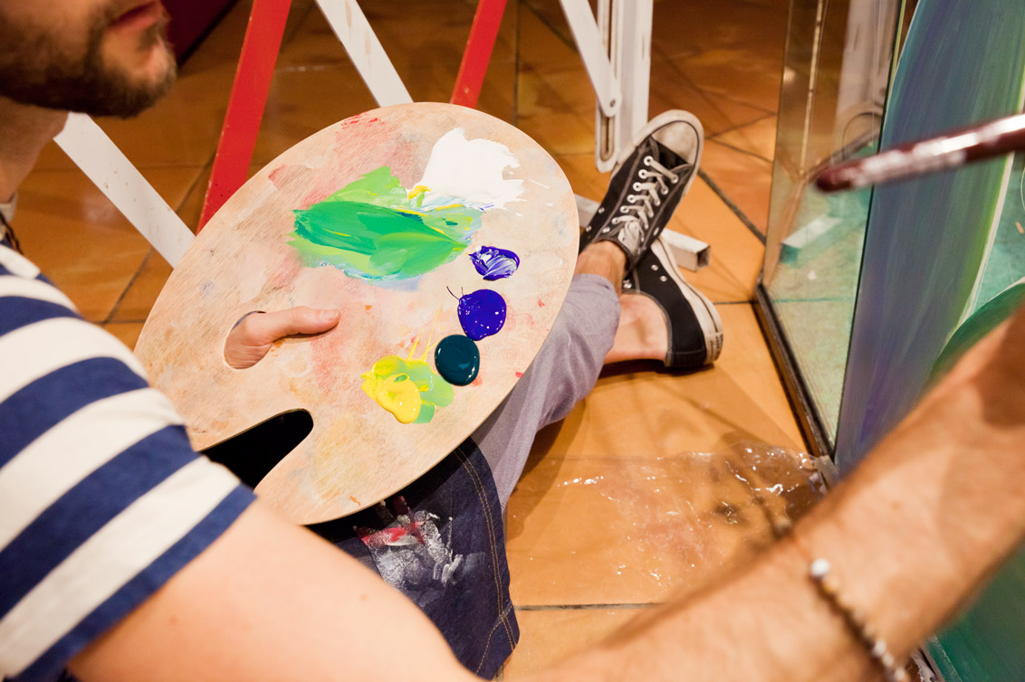
High-quality acrylic paint. Not too stiff, not too flowy. I tried a few and settled on Matisse Acrylic Flow. Large brushes and small brushes, paint pots, paint palette, drop sheet, music, a comfy pillow, pencils, glass pencils, windex, some rags, large sheets of paper, some plywood to practice on, posca markers, a four-inch razor for removal and trimming.
Step 1: The idea
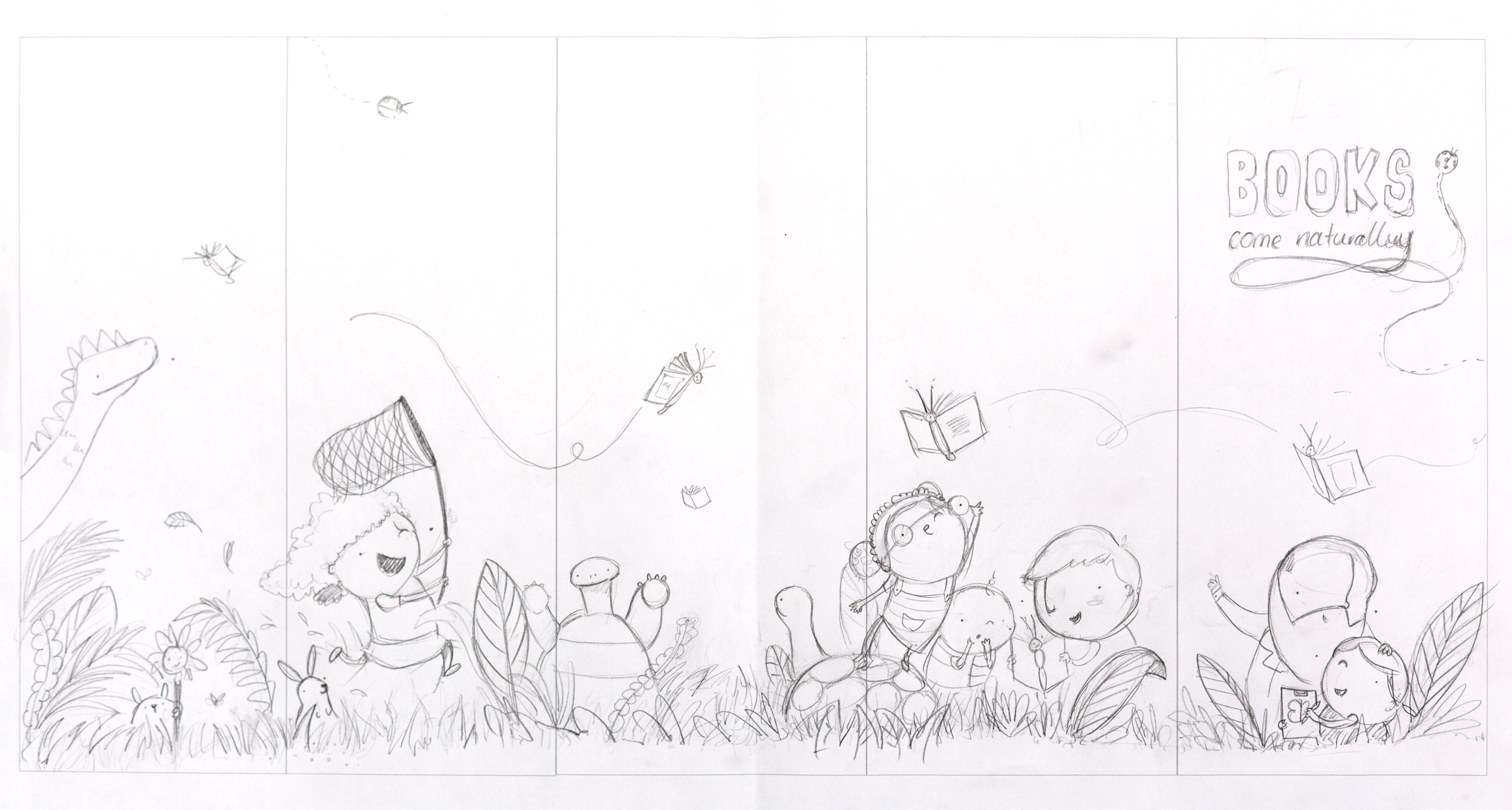
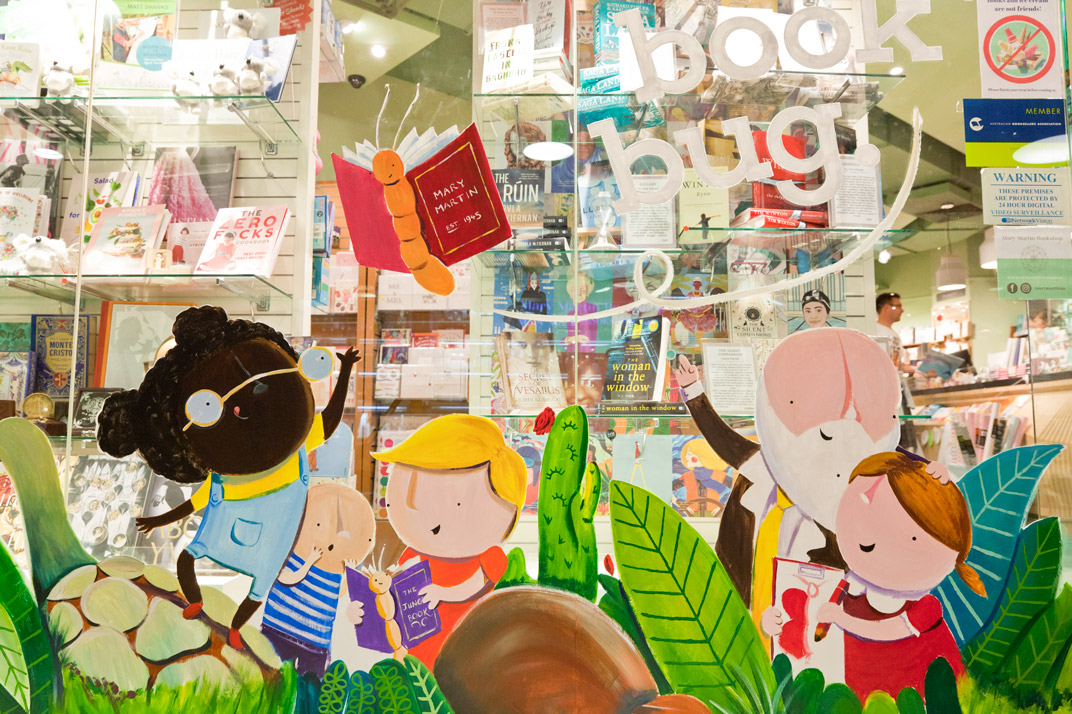
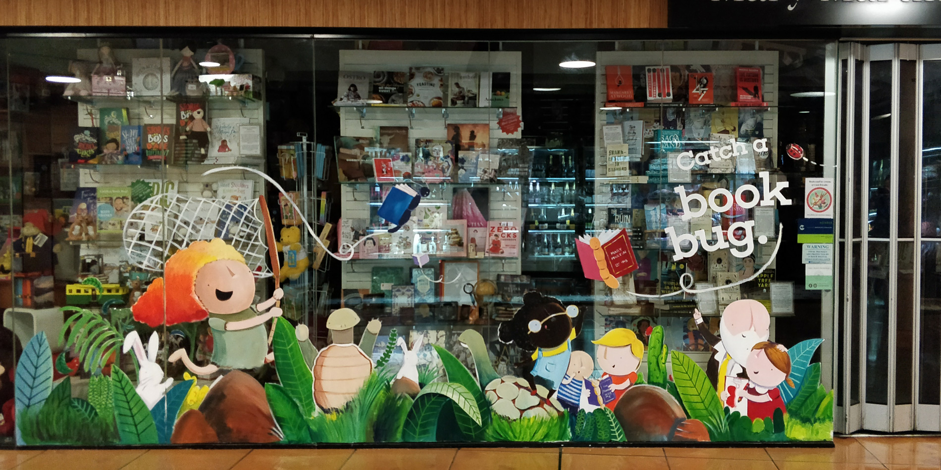
Every successful project starts with the idea. No matter how good your technical ability is, if you don’t have an idea with clear intent, your project will be a house of cards. For the Mary Martin window, I started by sketching at a small scale. In fact, precisely 1:25 scale. I made a template of the window panes using InDesign (but you can use any software) and printed them out so they’d fit on an A3 piece of paper. I had the freedom to focus on the concept and composition at a size I was familiar with first.
Where do ideas come from? Well, I’ve got the post for you.
Step 2: Scaling up
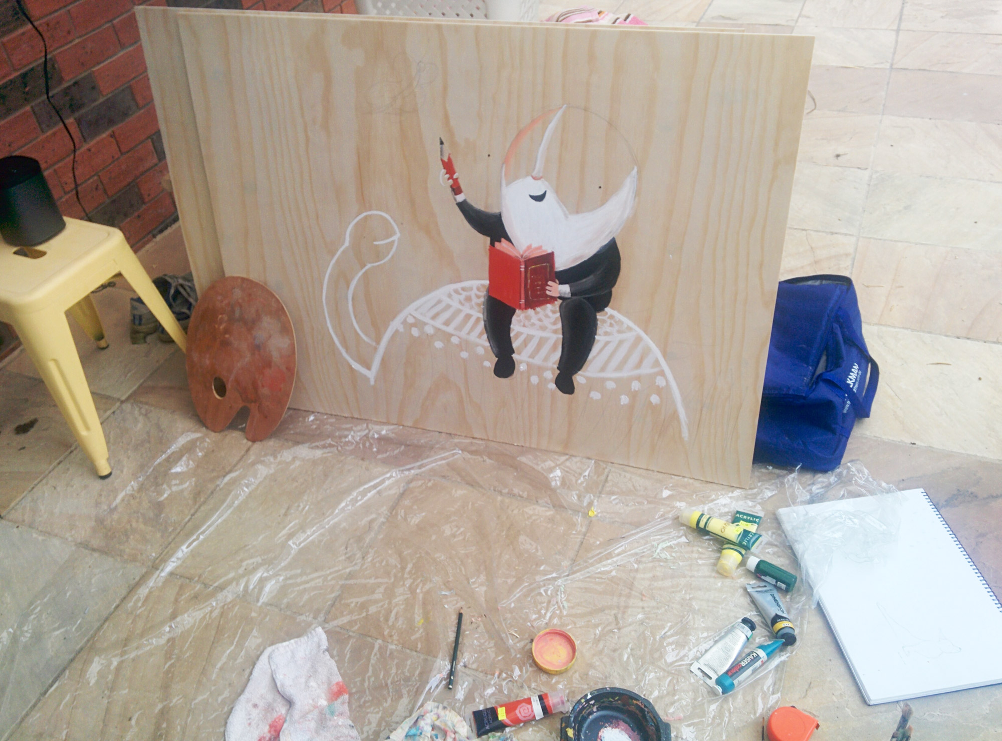
Having only ever painted for picture books, blowing up my artwork to something like 5m long is a bit intimidating, so I knew the only way to do it was to practice. I know my ‘style’ intimately now so I know when something looks ‘right’, and when it doesn’t.
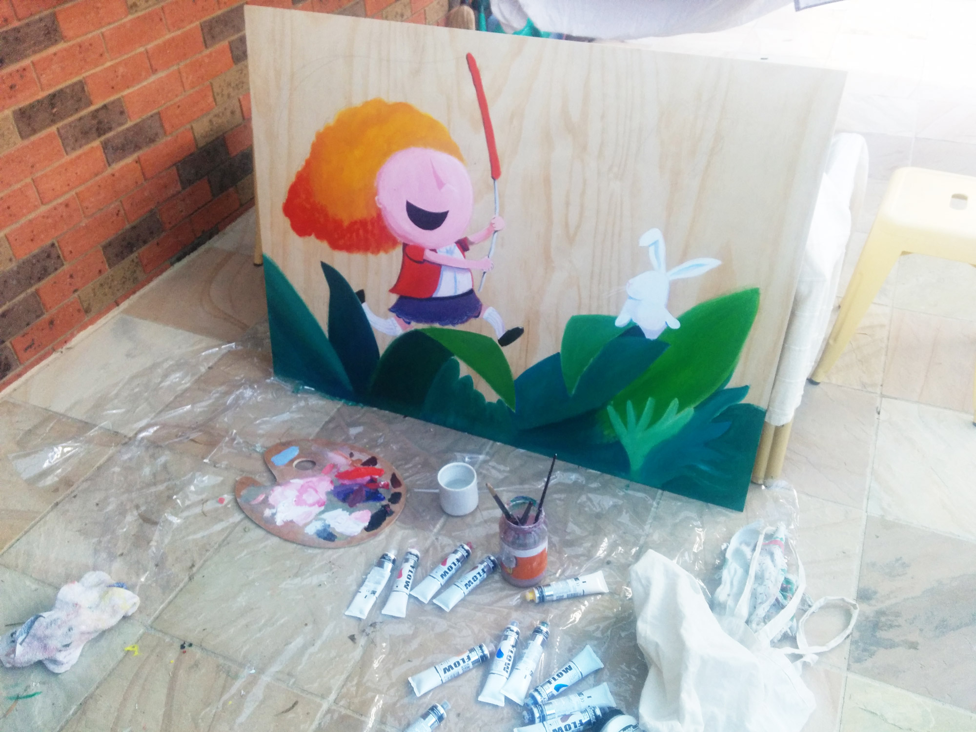
I bought a couple of large plywood sheets from Bunnings (1m x 2m) for about $10 each. Then, armed with a few dull old 2B pencils, a regular eraser and the idea, I started to sketch big. I didn’t try to replicate the whole mural, that’s far too intimidating, and it would’ve taken ages for me to get some feedback for my efforts. That’s the most important thing at this stage, finding the fastest path to getting feedback so you can learn quickly; it’s a chance for me to assess progress against what I was trying to achieve.
I focused one or two characters first and tried to replicate them as accurately as possible. The basic idea behind this approach was to train my muscle memory to adapt to the scale. I needed to “feel” what a good circle was like. Exactly how much should I be moving my wrist in the process? (The answer is not much). Things like eye-placement, body position and facial expression are core components of my characters, so I focussed on getting these correct first. I worked close, then stepped back a metre or two to see how it looked at a distance that people would typically pass by it.
Step 3: Acrylics
Colour mixing
Before this mural, I had never painted with acrylics. I went to the art store and selected a bare minimum of paints. I was familiar with working with a split-primary palette from watercolour, so I picked the same colours. How did I know they were the same colours? I ignored the sexy names they give them like, “Sunset Yellow” and just made sure the pigment numbers matched up. More on pigment numbers and how to choose colours.
I used my plywood sketches and followed the colour mixing principles I’d developed for watercolour to start to mix familiar colours. Skin tone, Hair etc. Because I use water in watercolour to make things lighter, I had to get become familiar with adding white in acrylic to make things lighter. Hot tip: By LOADS of white.
Applying acrylic paint on different surfaces
Painting on plywood and painting on glass are two VERY different things. Plywood is rougher and more absorbent than glass so as I was training myself on Plywood I started to worry that I didn’t have the physical strength to paint something that was five metres long. After a session or two on the ply, my shoulder started to ache. However, I persisted with getting a feel for mixing and applying acrylics to these two pieces of ply. I focussed on blending colours on the ply to make smooth gradients. I was trying to mimic watercolour washes, albeit with difficulty.
I began to understand overpainting and underpainting techniques and drying times depending on how warm the weather was. How much paint to use and mix on the palette, how much coverage I would get, and how transparent and opaque colours interacted with each other. I found the amount of information that seeped into my brain in 2 four-hour sessions was incredible.
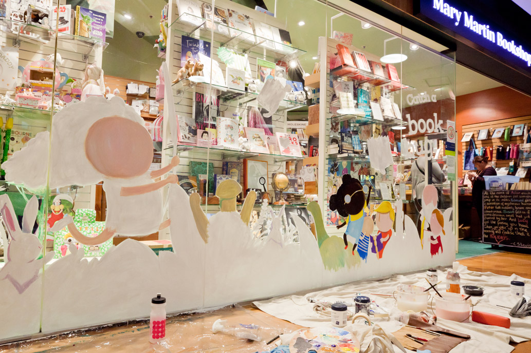
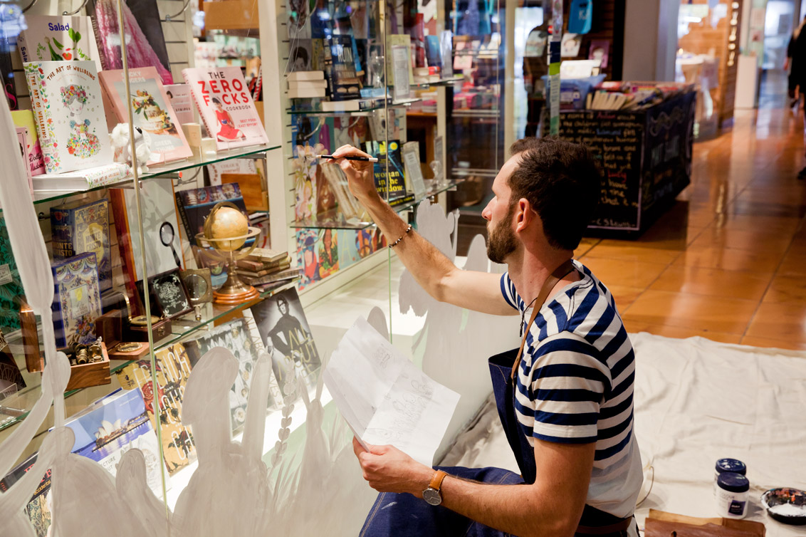
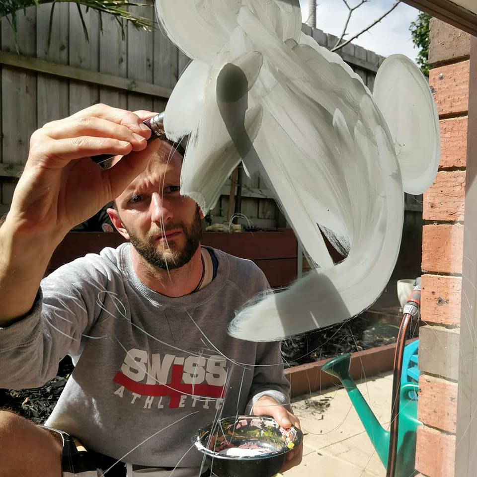
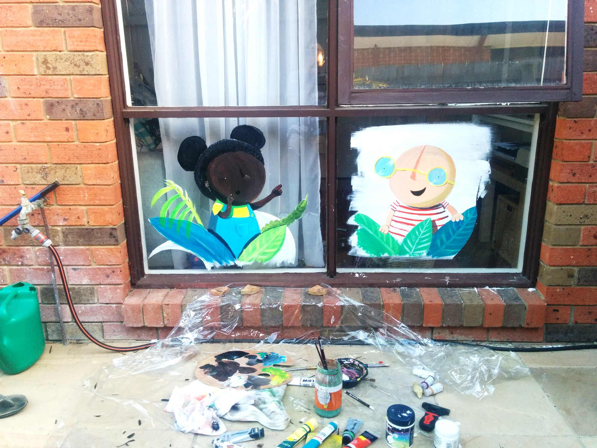
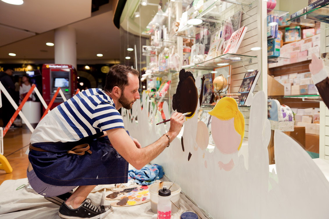
Painting acrylics on glass
Once I started to become partially comfortable with the application of acrylics on plywood, I was ready to move to the glass. I thought about ways in which I could get my hands on some cheap glass (cheap glass seems to be an oxymoron), and in the end, the easiest, most affordable, and the most convenient way was to use my home windows. With the permission of my partner of course.
Thanks to a few YouTube clips and some home practice, here are a few things to know before you start painting on glass:
- The direction of light is critical. You need to understand which side of the glass is getting the most light. Shop windows are generally quite dark indoors which means that when you paint on them and walk past it on the street, you see far less streaking in your paint application. But, like Mary Martin’s window display, sometimes there is lighting just inside the window to light up the display. If the light inside is stronger than the light coming from outside, you get HORRIBLE streaking.
- Lay down white first, as a base coat. Acrylic paint doesn’t stick to glass particularly well. The easiest way to have hassle-free painting and avoid weird streaking as I’ve described above is to lay down a plain white coat of basic house paint and let it dry. If the window you’re painting has more interior light than exterior light (as described above), you’ll need at least two coats for the streakiness to not show.
- You use far less paint on glass than other surfaces. This is pretty self- explanatory of course, but compared to plywood, my paint went further when I painted on glass.
- Trimming means you can paint loose. Acrylic on glass has a unique ability to be ‘cutaway’. By this, I mean if you get a shape or stroke wrong, you can take a scalpel or razor and trim the mistake off. The paint peels off easily, like sunburnt skin. Discovering this took SO much pressure off.
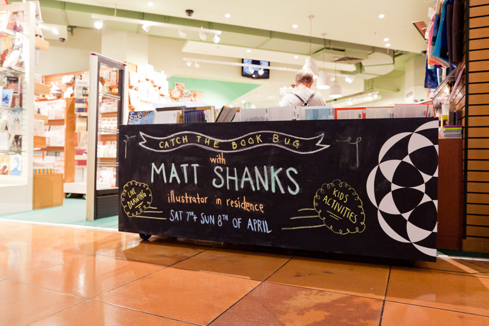
Working to a time-limit
For the Mary Martin mural, I had a hard time limit. Two days. 10am – 6pm. And, having never done this before, I had no idea whether it was too much time or too little time. So, I made sure the final concept was adaptable. This is where painting like an oil painter helps.
I’ve heard this best described as painting like a camera lens sees the world. The idea is to avoid focussing on one character or part of the drawing and getting it to completion but rather work across the whole drawing early. Block in big shapes and then, as you go, you spend more and more time adding levels of detail across the entire painting. The camera lens analogy is a good one. It’s like starting off with an unfocused image. You can see large blurry shapes and colours and values. Then, as you tweak the lens, you slowly bring the image in to focus.
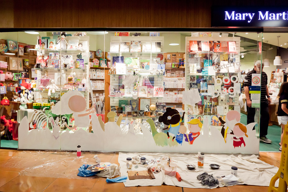
Painting in this way means that if you run short on time, you’re not left with one or two characters finished and the rest of the canvas untouched. It means that everything is somewhat coloured in and what’s probably missing if you run out time are particular details around clothing or hair, but you can get away with not having these if time is an issue.
Typography
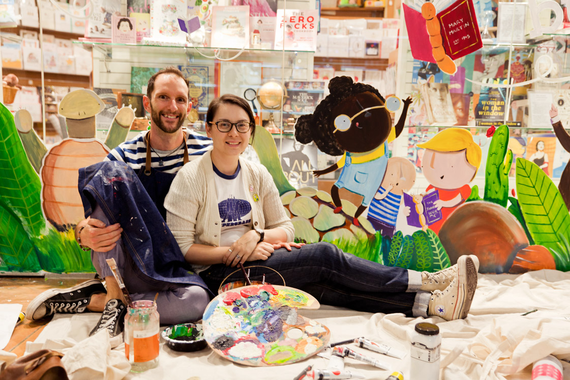
I have to admit that my partner came to the rescue. While I was busy painting our home windows, Mel’s graphic design skills came to the fore. We designed the typography layout together on the computer, then printed it out, tiled, across 6 or so pages. This gave us something to trace directly on to glass.
By this time I had cracked the ‘how to paint on glass’ mystery, so I was able to guide her with my ‘expert’ eye for how to use white house paint on glass. This touch of beautiful typography really lifted the whole design.
Logistics

Painting on location is always fraught with uncertainty. I’ve done enough sketching on location to be aware of things like water sources, clean up facilities and so on. Here’s a list of the things we had to consider for the Mary Martin mural.
- Wash up spaces: With five metres of painting, there would need to be a lot of wash up. I needed, at minimum, a sink with running water.
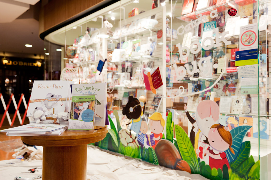
- Exact sizes: Doing all of this prep work at 1:25 scale is not particularly useful. Given that the window is the bookshop’s primary chance to lure people into the store with their beautiful displays of exciting books, I needed to go in a number of times to get exact measurements of how high the mural good be without getting in the way of the book displays.
- Parking/Cost of parking: Getting to and from the venue is always something to consider. With a lot of painting supplies, we needed easy access to the car at all times during the day. Fortunately for us, the car park at Southgate was excellent both in cost and location.
- Lunch breaks: When I paint, I lose myself. I get in a flow state, and I can go for 12 hours without remembering to eat; that’s only when I’m at home alone. Painting in public is even more exciting because you’re having conversations with people, inspiring little kids to paint and draw themselves, and signing books. Taking lunch seems like an inconvenience, but it’s SO important to be able to sustain your energy. If there aren’t any cafes or shops near to the site, don’t forget to pack lunch and a thermos of tea.
- Safety barriers: We were painting in a mall, so barriers were provided for us, but it’s important to have something to demarcate your space. Not only do you need it for public safety, but it’s just WAY more comfortable to paint when you’ve got some space that you know people won’t invade. If they had their choice, people would come right up to the glass to have a chat. Can you imagine just finishing a piece only to have a member of the public accidentally lean on it or smudge it!
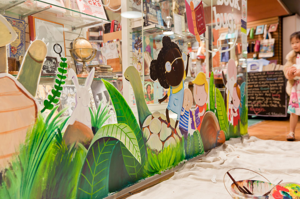
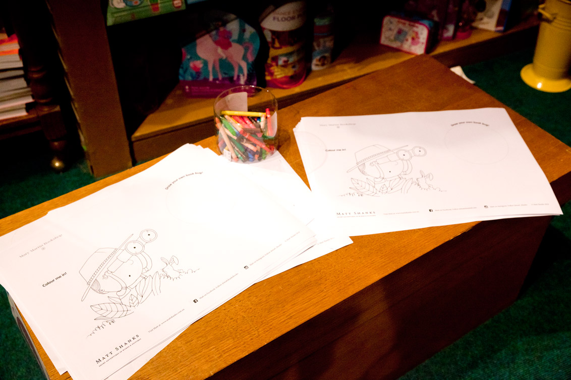
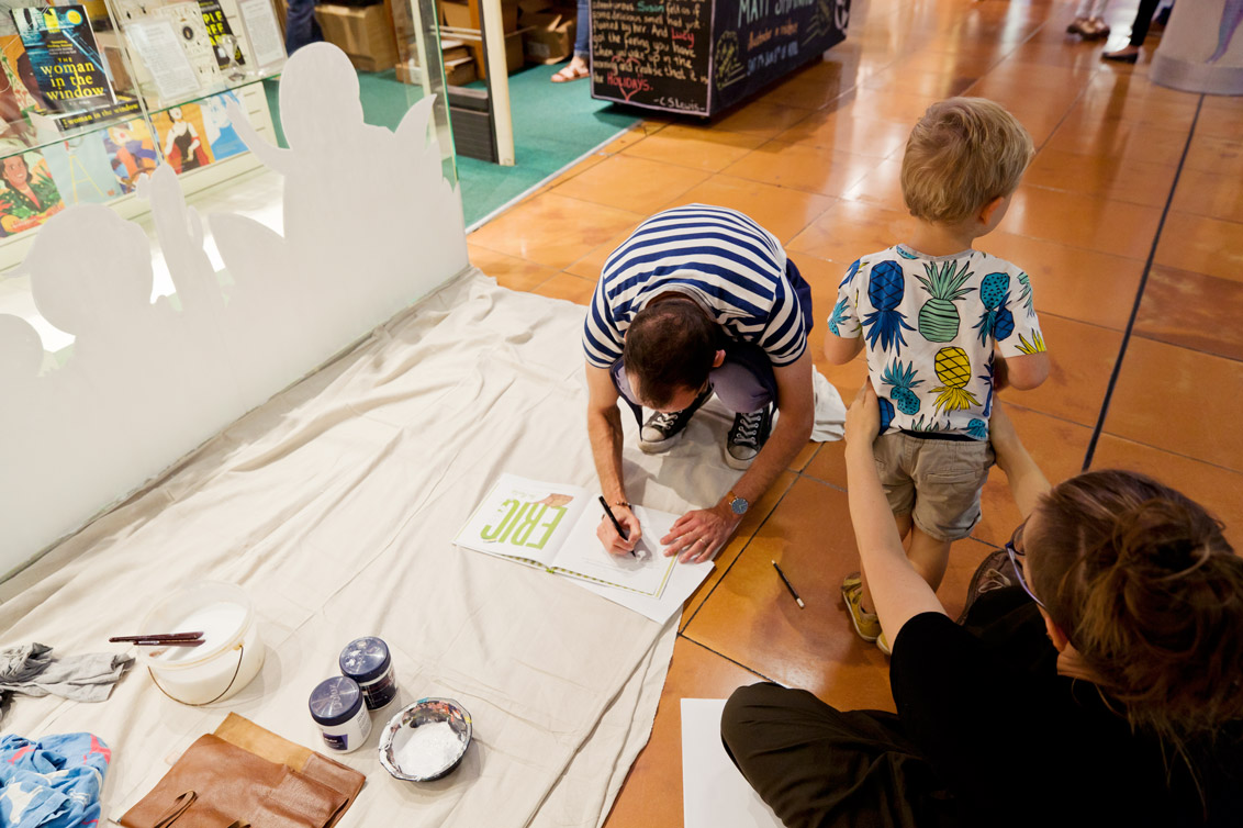
- Marketing/Colouring in activities: Painting a mural for a bookshop is more than about ‘just painting a mural’. Bookshops are a kind of heartbeat in our community. They bring people of all ages together – hunters looking for their next literary adventure. Having an artist-in-residence is a special thing for a lot of people, and so if there’s anything you can do to make that experience more special, I believe it’s your responsibility as an artist to do that. For Mary Martin, I made some bespoke colouring sheets and bought a pile of crayons for the kids to use. I wanted them to make their own art as so many often want to do when they see an adult painting. It’s such a natural experience for humans to do this and I figure if I’m lucky enough to have found the confidence to share it, then it should benefit as many people as possible, not just ‘the client.’
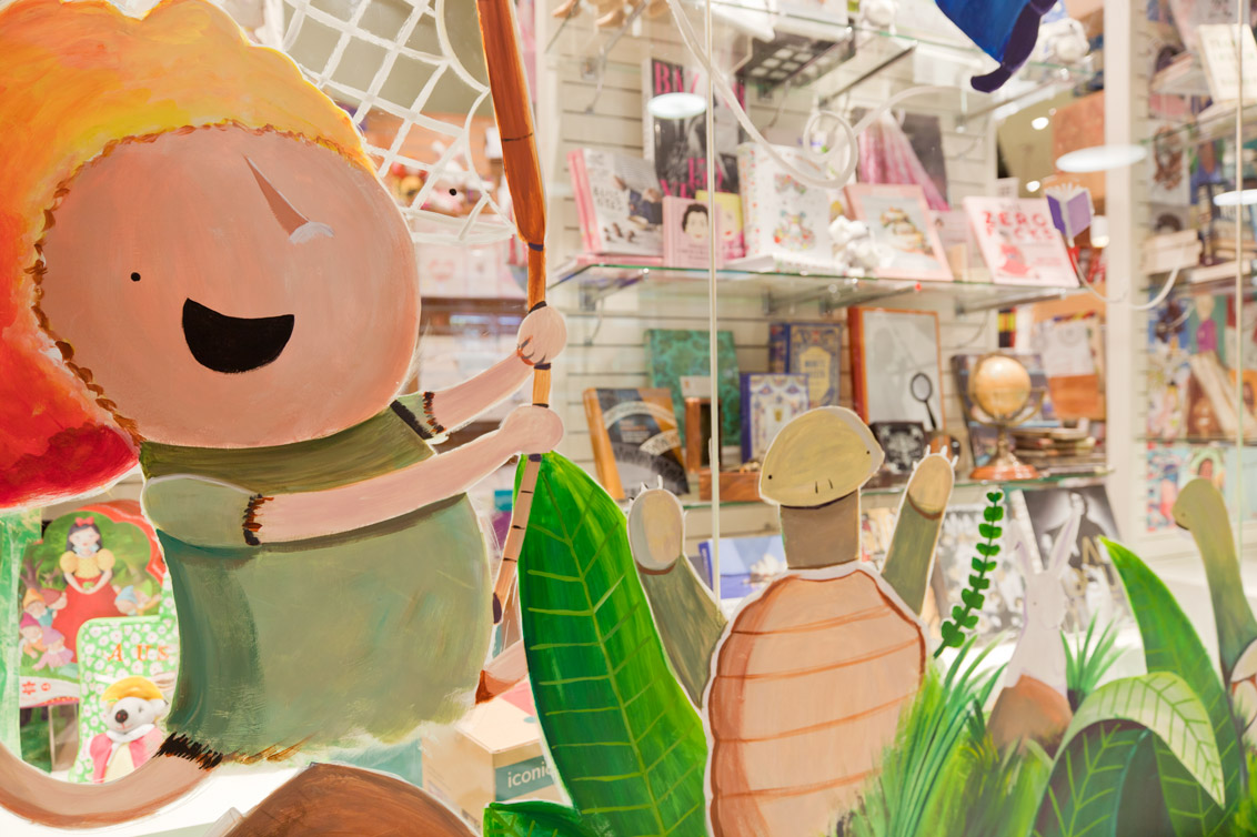
The final result
It was such a success! The bookshop loved it, the public loved it and, well, I was a little bit proud of it myself. I am also HUGELY thankful to my ever-supporting wife Melissa who not only helped with the painting but also documented the 2 days so beautifully with this lovely collection of photos.