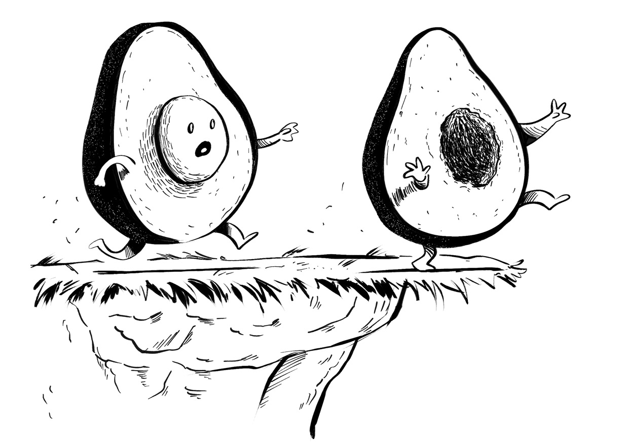
Occassionally, I get people asking me for some advice about how to become a children’s book illustrator. Everyone knows it’s competitive, and they know it’s hard to ‘break in’ – most simply don’t know where to start. I find myself giving one piece of advice: more often than not, a book illustrator’s folio, amongst other things, should show your ability to pair words and images, together.
Now, I know those two things – words and images – can stand apart and still satisfy. Just like wine and food: you don’t need food to enjoy wine. But, a cleverly selected food/wine pairing amplifies both of them – it tells you a lot more about the food and wine individually when you eat them together.
Words and images work the same way. And, if one is in the business of illustrating children’s books, or, in other words, visual storytelling, 90% of the work we do includes words – so why wouldn’t a portfolio show them together?
When you pair words with illustrations, a few things happen:
- You can tell dramatically different stories (contrasting gentle text with energetic illustrations, for example, provide a very striking mood).
- You showcase your ‘voice’; or, in other words, how you think. For me, that’s mostly humour and movement.
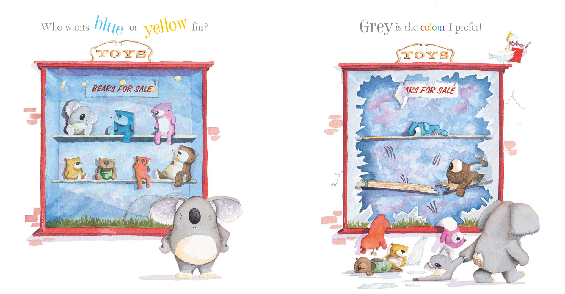
Take, for example, the words below, from my book with Jackie French, Koala Bare:
“Who wants blue or yellow fur? Grey is the colour I prefer.”
Now, for context, we know the main character is a Koala, and that he’s angry that people keep calling him a bear.
There’s nothing in that text that says that the images need to be in a toy store, that the blue and yellow fur is about toy teddy bears, or that the main character is even that angry. He has a preference for grey, but it’s not a demand. Yet, by pairing these curious and quite ‘plain’ words with an image that shows shattered glass, teddy bears strewn all over, we find ourselves laughing a lot more.

This image could easily have been something else. Maybe the koala is looking sad upon a photo of some bears and he’s missing spending time with other koalas? Maybe he’s in a hairdresser and the barber is styling him right next to a few other bears who are getting blue and yellow perms?
None of these are right or wrong ideas, they’re simply trying to make the point that the way someone interprets a text can be a powerful vehicle of communication to a portfolio viewer.
It’s an easy exercise for any current or future book illustrator to try. Pick a text (preferably the raw text, without illustrations so you’re not influenced), and see how you might illustrate it, naturally. Do this enough times and, perhaps, like me, you’ll struggle to be able to draw an image without the additional playfulness of words. You might also find your begin to see your voice emerge – and that’s exciting!

