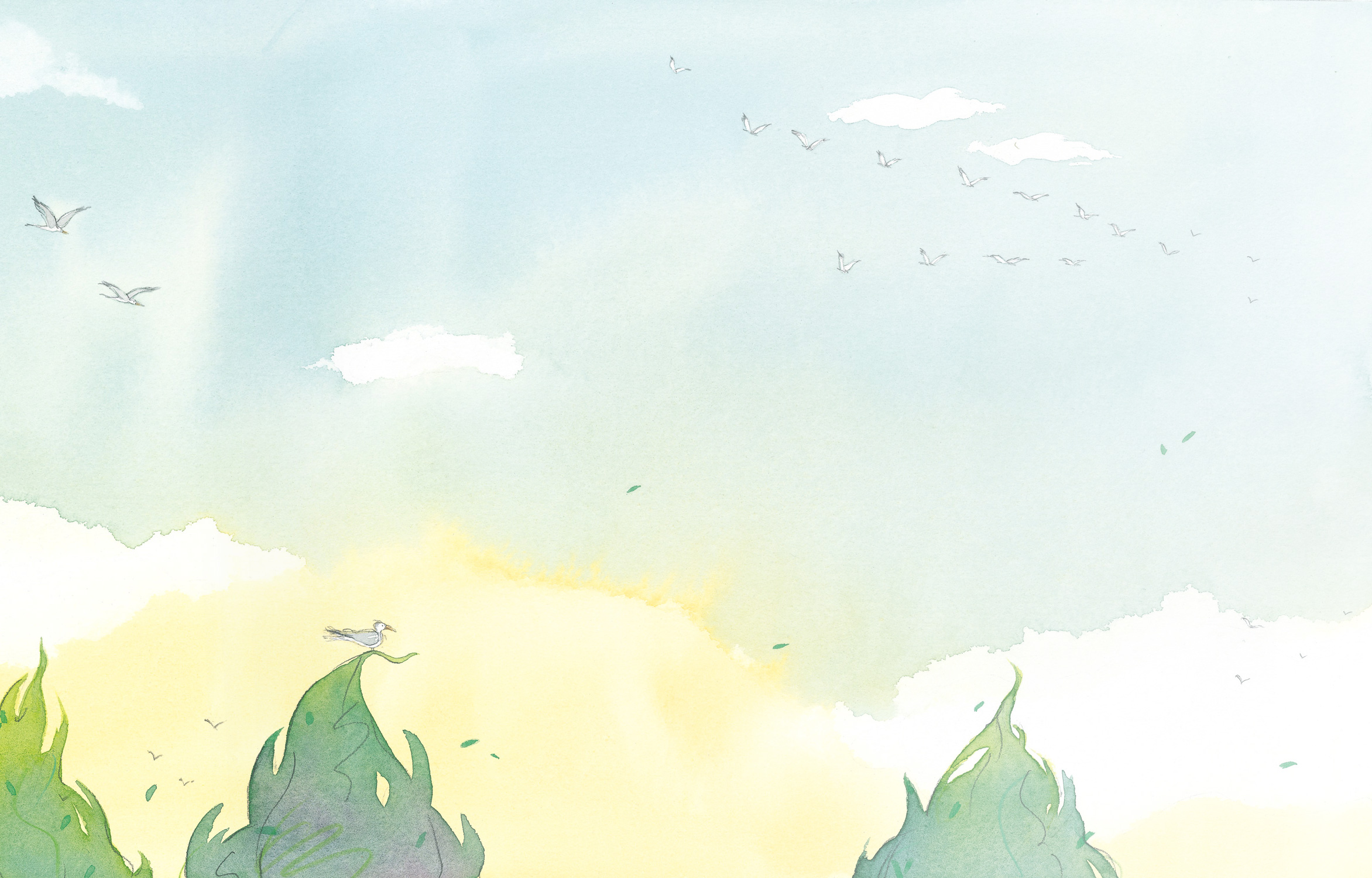
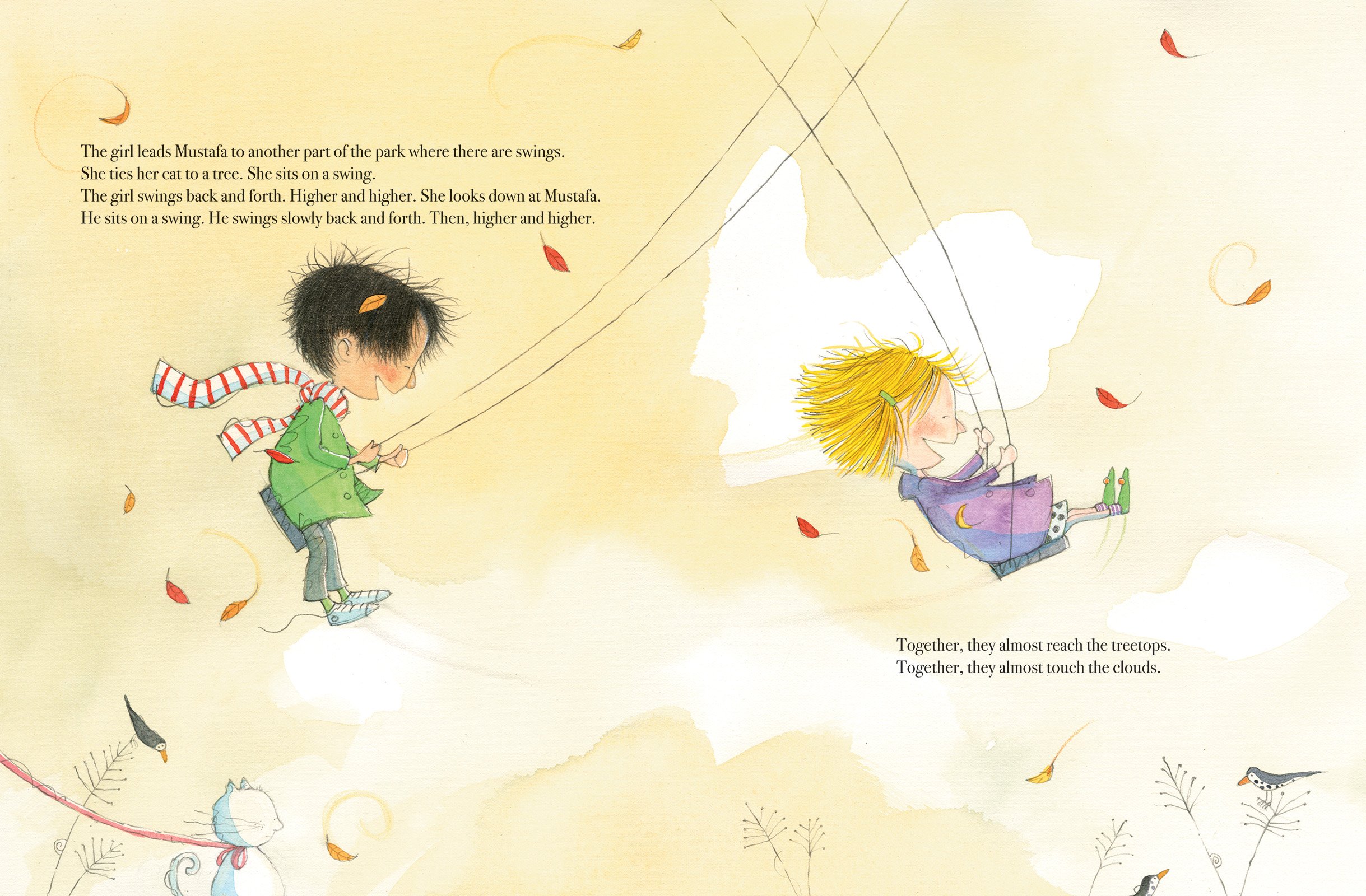
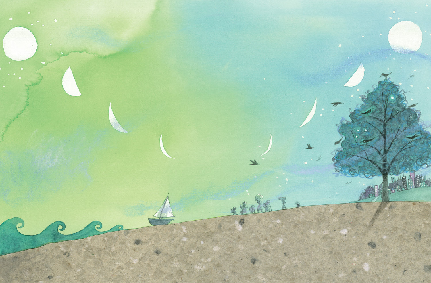
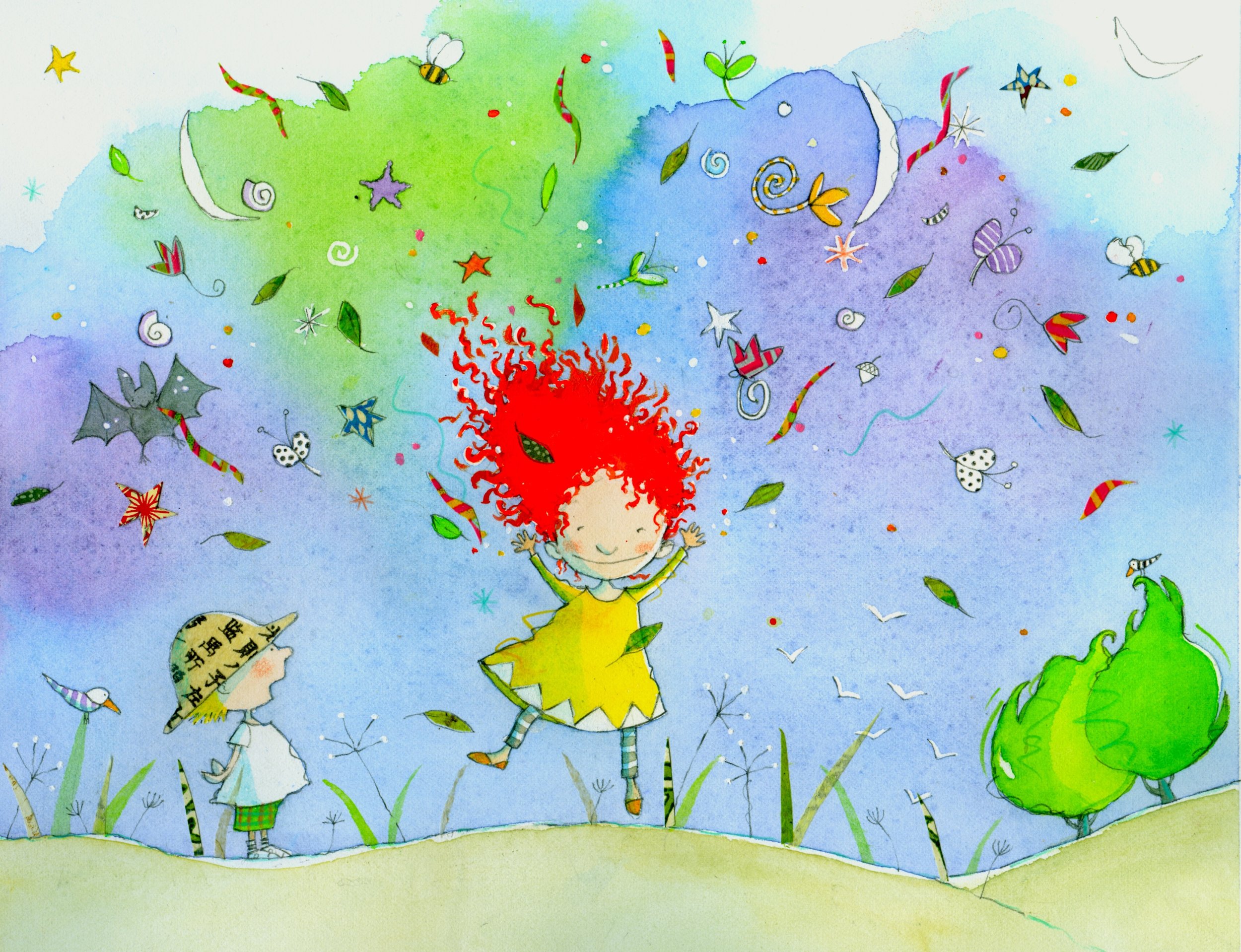
One of the most joyous parts of using watercolour is painting skies. There’s something about the softness of watercolour pigment that gives any sky a sense of lightness and delicacy that no other medium can easily mimic. But, there are only so many blue skies one can paint before, well, skies become a bit dull.

When I first started watercolour, I stumbled across the energetic work of Marie-Louise Gay. I found her work at a time when I was trying to understand the basics of how watercolour worked. Her lightness of touch and the energy in her work was something that I was drawn to immediately. I also found I came back to it, time and time again, as my confidence in the medium grew over the years.

Paint what you see
In the early days of my time with watercolour, I was obsessed with capturing reality. Skies were blue, trees–green, the sun, yellow. With every painting, I began to learn the ‘formula’ for matching these ‘realistic’ colours of the world to a watercolour pigment. Once this mapping gets into your muscle memory, you’re ready to move on. The next step? Beyond reality.

Beyond reality: Paint what you don’t see
The thing I love about Marie-Louise Gay’s work is how her use of colour isn’t about capturing reality any more. It’s about capturing a mood. It’s about a direct mapping of colour to the way colours make us feel.

Whether it’s the heat of the day, the coolness of the air by the sea, or that moment of the day whether the sun dips its weary head below the horizon, Marie-Louise Gay’s work sends us beyond reality to a time where the sky didn’t have to be blue, if we imagined it wasn’t.
