
There are very few old-timey painters of Australian landscapes that I swoon over. In fact, Arthur Streeton might be the only one.
I’m a fine art Luddite, ashamedly so. As a child, my parents never entertained activities as ‘high-brow’ as painting, literature or poetry. Who does when you’re busy trying to get food on the table for three kids? But, it did provide the opportunity for me to enter an adult life untainted by early childhood opinions of Monet, Les Murray or Dickens (I think most kids think they’re pretty boring anyway). It also meant that my journey into painting only really started when I myself began painting, as an adult.
In my quest to understand watercolour and how it could be used to brilliant effect, I inevitably followed threads that led me to artists pursuing other media, like Arthur, with oils.
Oil painting, for me right now, is too much effort. I’m far too lazy to deal with the cleaning up. I don’t have enough room, and quite frankly, I don’t like the smell of painting with oil paints. All those solvents and thinners completely remove the joy I find in laying brush to canvas for fun. But boy do I appreciate a fine oil work when I see them.
When I first met Streeton
What I’m about to say may sound insane to anyone with a minute bit of art history knowledge, but I first came across Arthur Streeton’s work in 2017 (I know right?!) I was speaking at The Adelaide Festival of Children’s Books that was hosted at a beautiful heritage property in South Australia called Carrick Hill. While I wandered the grounds and the beautiful historic house that gives Carrick Hill its name, I noticed a flyer for an exhibition of paintings from someone called “Arthur Streeton.” It was happening there the following week. I put it in the back of mind as something I should probably pop back in to see. I like exhibitions anyway, and some of the work on the poster looked nice.
Anyway, the day arrived. I Ubered (is that verb now?) my way to Carrick Hill and paid my entry fee for the exhibition. I cloaked my coat and began to explore. Suffice to say; I was immediately arrested by the colour and light in Arthur’s work.
After a little research, I realised that this Streeton fellow was quite revered. Funny that! I also felt a little stupid, coming to the party so late. But since then, I’ve travelled to galleries in Victoria, NSW and the ACT to seek out Arthur’s work. The thing about seeing photos on the internet is that you don’t get to see the proper colour and light that was painted by the artist, nor the brush strokes that command one’s attention when you’re faced with one of the magnificent works.
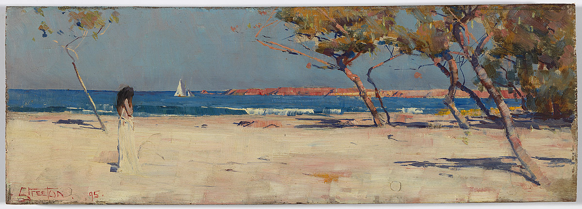
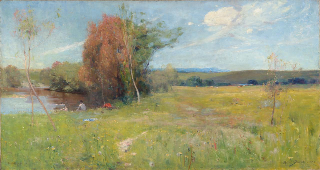
As it turns out, our Australian galleries are awash with Streetons. They also contain many paintings by the group of Australian Impressionists which painted alongside him. But none of them could achieve quite what Streeton could.
What is it about Arthur Streeton?
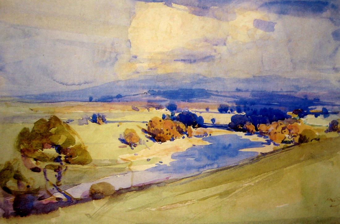
Trapping light so it can’t escape
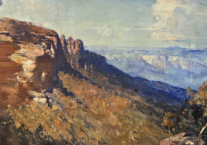
I don’t know why everyone else seems to like Streeton but what struck me about his work is his bold use of colour for the time. The first painting of his I ever saw, The Blue Mountains, has such a depth of complementary colours, exquisite and delicate use of blues and golds, that it felt as though the light was living in the painting. Artists talk about capturing light, and I often interpret that as recording light. But Streeton actually trapped it in his canvas. They aren’t colours I would have instinctively chosen, but to see them used in this way is incredible. I’ve certainly taken my lessons from viewing Streeton’s original works and introduced some of those ideas in my practice.
That Pink Ochre colour
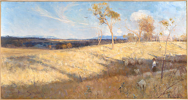
Streeton also seems to have found the perfect colour mixtures for the soft interplay of granite, soil, and sand in our Australian earth. I can only think of these colours as ‘pink ochre’. It’s a lovely, blushing colour – probably something like Permanent Rose with a dash of Yellow Ochre in it. I’ve used a similar colour in my illustration work for skin (especially either young skin, or ancient skin) and also our dusky sky. But never for rock or earth.
Finally
Whether, like me, you’d never heard of Streeton because you’ve been living in a bubble that didn’t contain any reference to fine art history in Australia, or you’re a fine art aficionado, I think everyone who has tried to paint the Australian landscape will agree that Streeton had something special. It hasn’t been replicated or improved upon since.
You can find his work in the Art Gallery of NSW, the National Gallery of Victoria or the National Gallery of Australia in Canberra… well, at least that’s where I’ve been. You can probably find him all over the place. The man was certainly prolific.