I come from a background in Agile software development which has instilled in me a habit of running small, low-cost experiments to learn new things quickly. I take those new things I learn, and then iterate on their solution until I get something that works just right. It allows me to move quickly and cheaply.
I’ve approached my art career in the same way so far and it’s been working out a treat. I don’t think there’s a better example of this approach than how my studio palette has evolved over the years.
The problem is, I’m a sucker for beautiful art supplies. I’ve lusted for years over a brass studio palette with beautiful big pans and swathes of mixing area.
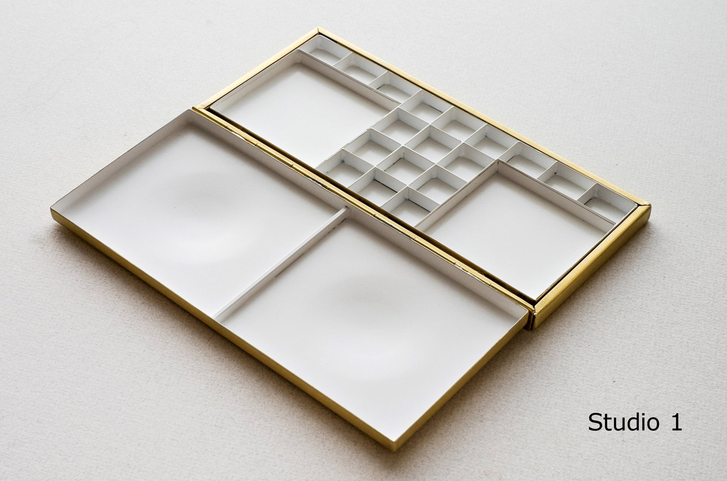
But every time I think I’m ready to take the plunge and spend around 500GBP (that’s about 1000AUD at the time of writing YIKES), I just can’t imagine moving away from my super flexible, lightweight approach to what I’ve got right now.
My Current Studio Palette
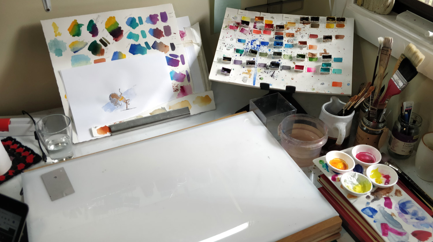
It’s ugly, and probably not going to get too many Instagram likes, but I love it.
My ad-hoc, hacked-together palette has become a core part of my workflow and it’s been with me for 5 years now. It’s ugly, and probably not going to get too many Instagram likes, but I love it.
What’s my palette I hear you ask? It’s quite simply:
- A bunch of regular old watercolour pans (60c each),
- blu-tacked to a small piece of foamcore ($1.20),
- which sits on an ergonomic, 15″ laptop stand ($129 – I’ll explain why I splurged in a minute)
So, for a total of about $144, I’ve got the perfect studio palette. And, until I splurged for the laptop stand, the palette cost was a grand total of $15.
Before the laptop stand, the piece of foam core was glued to an 4×2 block of wood so I could have it an angle. The reason I ‘upgraded’ to a laptop stand was mainly due to the tight space in which I work. I don’t have a fancy, light-filled studio. It’s just my spare room. But the constraint means that I’ve had to think very creatively about how I organise my space.
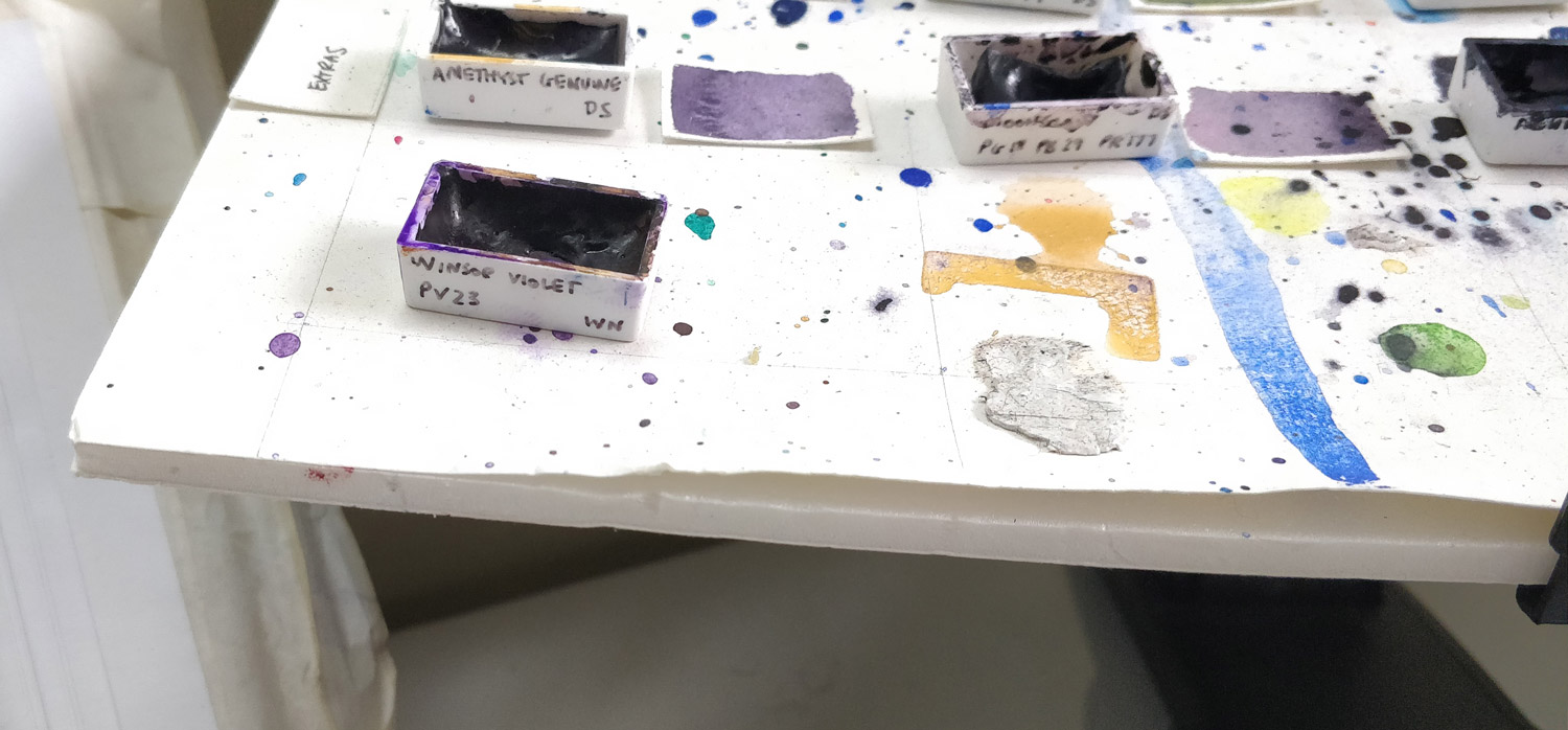
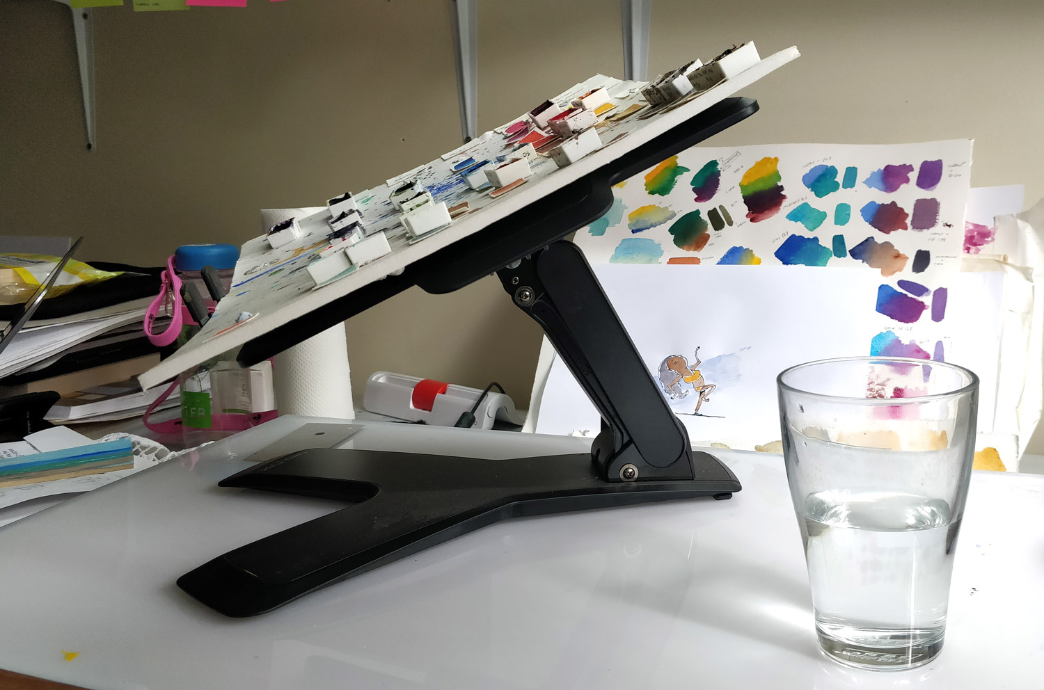
The wonderful thing about using standard-sized, regular watercolour pans is that when I travel, I can just quickly pluck some very familiar colours from my studio palette and put them in a little travel palette and run out the door. That’s why you can see there are a few colours missing from these photos below. It also proves that yes, there’s nothing fancy, it’s just blu-tac.
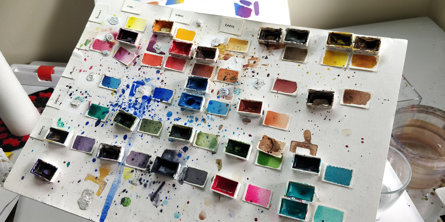
Using blu-tac has other advantages too. Not only is it good for travel but it’s also good for experimenting with how I arrange my colours. I’ve iterated on this a number of times too. Do I follow the colour wheel? Do I arrange warm and cool colours together? I can do a complementary colour pair arrangement if I want. In the end, I settled on an arrangement inspired by watercolour artist Jane Blundell. It’s a 3×3 grid of cool/warm/earth and primary colours. As I’ve illustrated more books, I’ve also added some greens and a few other specialty colours over time.
So there you have it. Simple, flexible and maybe not so elegant. In my quest to learn and improve I’m certain that the palette will continue to evolve both in colour choice and how I’ve arranged it. And I’m open to that, when the time is right.
