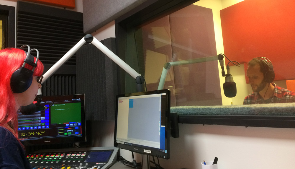
The world of children’s publishing is a constant surprise to me. Never in a million years would I have imagined I would ever experience some things that only writing and illustrating for children has given to me in my short career so far. I’m starting to lose track of the ways in which each and every experience has enriched my life. And now, another feather has been added to this cap. Vision Australia is now offering Eric the Postie to kids with impaired vision through their incredible initiative, The Feelix Library, and I got to record the reading!
Vision Australia records Eric the Postie for their Feelix Library
Vision Australia’s Feelix Book Kits
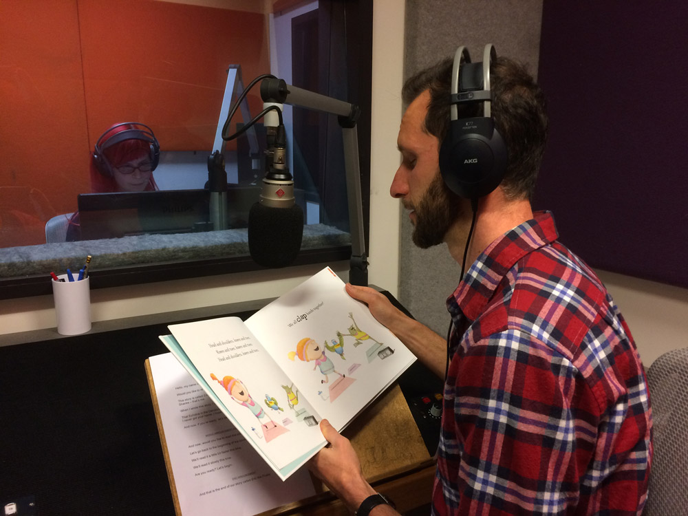
Registered members of Vision Australia’s Feelix Library can now borrow a copy of Eric the Postie. What do kids with impaired vision do with picture books you ask? Well, the wonderful folks at Vision Australia have worked that all out. Each picture book is supplied as a “kit”. Each kit includes a copy of Eric the Postie (with braille translation included), and some related sensory experiences that are themed around the book.
Matt channels his Play School memories of reading aloud to children
The fun part for me was having the opportunity to read Eric the Postie in Vision Australia’s custom-designed recording studio. You know, those double-sided glass rooms with microphones and headphones and all the check check check, one, two, one two stuff? Brilliant. Like the Beatles except, well, not as cool.
The ‘performance’ is burned to CD and included in the kit so families can listen to a reading, experience the tactility of the book, read along with the translated braille, and ultimately enjoy a multi-sensory experience when interacting with the touch/feel components of the kit.
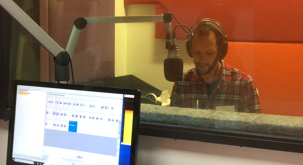
Matt ‘sings’ Heads Shoulders Knees and Toes. He won’t be auditioing for the X-Factor anytime soon
If this wasn’t enough to get excited about, they also asked me to read and *gulp* sing, two other nursery rhyme books of mine – Twinkle Twinkle Little Star and Head, Shoulders, Knees and Toes. The staff were expert in making me feel comfortable in this confronting scenario and I won’t be auditioning for The Voice any time soon. But, it’s an experience that will stay with me for a long time yet, and better still, we plan to add a few more books in the future, as well as do a live story time at the Vision Australia offices.
Why should I paint? Why should I draw? What gives me the right to ‘waste time’ on either? It’s not productive. No one is buying it. I could be doing something valuable. It’s taking up space in the house. I can’t get rid of this stuff. No one is buying it.
What happened to us? When did we become so goal-focussed? We outsource our lives to give us more time. More time to make more money. More time to be more ‘productive’ – whatever that means. We’re in a culture that measures success by reach, followers, income, revenue, profit, time, clickers, friends. Numbers are easy. There are formulas to follow. Algorithms to game. If you play by those rules, you can win. Easy.
What’s really scary? Actual risk. Personal risk. I find it interesting that insurance companies don’t have a policy for you if you try to put your heart into the world and it doesn’t work out. Or you reveal your soul, and it’s mocked. Or you discover a weakness you have that shakes you and your identity to your core. Why isn’t this insured? Why aren’t VCs and investors looking to double-down on someone’s identity, mental health, courage, resilience?
Numbers protect us. They give us a value that we can pretend is a reflection of how successful or productive we are. How much we’re worth. Ridiculous phrases like “High-Net-Worth” individuals exist. For goodness sake.
But there’s another currency. One that only those who trade in it really understand. VCs won’t invest in it. Insurance companies won’t insure against its loss. No, it’s not Bitcoin. It doesn’t work on numbers. It can’t be objectively calculated or assessed for risk. No compensation can match a loss in this currency. It’s the currency of the soul.
When you work in a world of quantitative assessment, it’s difficult to prioritise things against a different set of outcomes. Outcomes that run so deeply that no one else understands them. Outcomes that aren’t objectively quantifiable. What sort of person am I? What is my moral code? What are my strengths and weaknesses? Who am I? There have been attempts by science to codify these things. But it’s not objective. It can’t be. This parallel world of qualitative outcomes is wholly subjective, and the only assessment that matters is one’s own. It’s about investing time in yourself, through making art. Art is one of the most important ways to discover who you really are.
So, make things. Things that fill your soul and mind with warmth. When you do, you’ll know what it’s like to be an artist. Once you get that glimpse, it’s a very difficult thing to turn away from. The returns in this market are joyous and overwhelming if you’re willing and courageous enough to play. They are found in the process. An activity where the objective view of third parties doesn’t matter, even though it’s difficult to ignore. People may still pass condescending remarks, or tell you that it doesn’t look like anything to them, or they don’t get the point of it. But that IS the point. Because art is about the artist. The individual. It’s the one activity that helps you make sense of the world. The act of creating is itself a step toward becoming a fuller person. One who is more in touch with their own weaknesses, fears, strengths, and who one really is.
You can’t game self-discovery through art. There are no rules that apply to more than one person. All we need to do is ignore the numbers and explore. Play, for play’s sake, what comes out will be art. And the market, for once, is in your favour.
I’ve never really identified with being a ‘literary’ person. And yes, I’m aware of the irony given I’m an author/illustrator. I’ve always identified with being a more visual person rather than a wordsmith. As a kid, I remember drawing a lot, but I don’t remember reading or writing very much.
To me, the term ‘literary’ feels stuffy and pompous. It evokes images of snifters of brandy, houndstooth jackets with elbow patches, and old men smoking pipes while saying things like, “Indeed. I do agree.” Things that are too literary are things like poetry (Oh god, poetry!) or ‘classic’ novels like War and Peace, or anything written by Charles Dickens; those books that people say, “You simply must read if you’re serious about English or language.”
It’s only in recent years that I’ve discovered the beauty and joy of language. Not just to describe, but it helps me remember. It helps me sort out my thoughts and it helps me escape. I love to read other people’s language for the latter, and I’ve begun a conscious effort to write my own words for the former.
Since I’ve begun to read (thanks to my wife), I’ve found this overwhelming urge to play with my own words. To see how words can complement pictures. Sometimes drawing and colouring fails to capture a time and place. When pictures fail, I turn to words, and it turns out that it’s incredibly fun. I call it word-sketching.
What is a word-sketch?
A word-sketch is a bit like a poem, but I don’t use the word ‘poem’ because I find that I put too much pressure on myself to produce ‘poetry.’ A poem evokes complete-ness. A work of art. It becomes ‘literary’. And works of art are scary because they mean that I’m supposed to have tried to do something, and I’m supposed to have done it well. In contrast, “word-sketching” is simply an attempt to capture the feeling of a time and place at that time and place. There’s no pressure. It’s not meant for publication or sharing. It’s merely a method of writing that makes me more aware of my surroundings. It helps me slow down.
When I travel, I always take a sketchbook. I love to capture the buildings and spaces I see. I prefer it to photography. It’s a way to add or remove bits from a picture of a place based on the way I feel. Sure, I walk away with fewer images, but the ones I create run deep – a memory burned in the brain. Photographic accuracy isn’t the goal of a visual sketch, and it’s important to me that I keep it that way.
Think of a word-sketch like a visual sketch. But instead of using drawing skills (colour, line, and shape), it uses words, grammar, and punctuation instead. While a visual sketch can help me describe the colour and shape of things, a word sketch helps me ‘feel’ a place. It’s full of references to things I did — things that happened that day and what’s happening at that moment. It works like a cryptic diary entry. An external reader should feel something, but they probably would not see or understand all the references I use. Some of it might sound like mumbo jumbo, and some of it might sound utterly beautiful. Everyone who reads it will probably take something different away. And that’s OK, because it’s not for anyone else, it’s for me.
There are no rules with word-sketching (because I made it up) but it typically doesn’t follow a well-known poetic structure, those confusing literary terms like, “Dactylic pentameter”. It’s a free form of writing where the idea is to capture the essence of a place. Just describe what you see/hear/feel. Literary types probably call it “En Plein Air Free Verse.” See how fancy words can ruin ideas?
There’s no defined length to a word-sketch but, you always seem to know when you’ve finished one. You just sort of, run out of things to say and feel happy having gone through the process.
An example
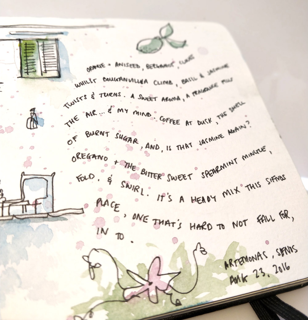
Here’s one from my recent trip to Greece:
Orange, aniseed, bergamot, cloves,
Whilst bougainvillaea climb, basil and jasmine twists and turns.
A sweet aroma, a fragrance fills the air…
and my mind.
Coffee at dusk, the smell of burnt sugar, and
is that jasmine again?
Oregano and the bittersweet spearmint mingle, fold and swirl.
It’s a heady mix, this Sifnos place.
One that’s hard not to fall for,
Into.
A page from my sketchbook when I word-sketched a moment on Sifnos in Greece
And just in case you think you need to be on holiday to do this sort of thing, here’s another from this morning. I wrote it when I was sitting on the train and this lady who looked as though she took Cruella De Ville for fashion inspiration sat across from me having just purchased a set of cheap ring jewellery:
The Lady of Lovisa
She untwisted twist ties
Awkwardly, with chopstick fingers.
Costume jewellery.
Bling.
Rings.
She arranged her accoutrements
Subtle
and Precise.
A ring or two for a finger,
a finger for every purpose.
With glamour came confidence
a bargain price, $4.99.
Why is word-sketching important?
It expands vocabulary: Word-sketching stretches my vocabulary. It makes me think hard (and quick) about the specific words I want to use to capture a feeling or a moment. Quite often, I surprise myself. As I’m a visual person, I tend to find it easier to describe what I see in shape and colour. I know that I can ‘paint warm’ by using yellow, or paint ‘cool and calm’ by using blue. But there’s also a difference in using the words ‘cool’ or ‘calm’ to precisely construct a feeling using words.
It opens me up to describing all senses: I’m suddenly opened up to a whole other realm of senses when I word-sketch. It’s quite difficult to capture how something smells or tastes if you’re visual-sketching a moment, but with words, those descriptions are at your fingertips.
It helps me remember: I often find I use events that happened during the day to try to describe the things I might be feeling or noticing at the time I’m writing. One example of this: “Strawberry lemonade cast on cubist landscape.”
I had noticed that the sunset gave all the white buildings a very pink light. Earlier that day, we had a cocktail by the beach called a “Strawberry Lemonade” that was also a very translucent pink so I recorded that little moment, but in the context of the sunset I was trying to describe. No one else will understand the reference without the backstory, but I didn’t write it for anyone else.
Most importantly, I can feel that word-sketching is helping me become a more complete artist. I’m learning how the components of written language (words, punctuation, grammar) behave and feel like my more intuitive art of visual expression. In the end, I want to be the best picture book creator, story-teller and artist I can be, and word-sketching is a brilliant, low-pressure tool to use.
Brief instructions for how to word-sketch
If word-sketching sounds like fun to you and you’d like to give it a go, I’ve tried to document the process I go through. It’s still very new to me, so chances are this will change as I evolve myself and learn better ways to express my true process. But here’s where it stands right now.
Grab a small book (or a piece of paper) and a pen
Find a place to sit. This might be somewhere idyllic like a Greek Island beach, or it could be outside your corner store or even on a train on your daily commute.
Take about one minute, and just watch. Really try to pay attention to what’s going on around you. Listen and smell. Don’t write anything yet. Just think. What can you hear? What can you see? Is there a breeze? Is it cold or hot? What are people wearing? What does the sky remind you of?
After a minute or so, start jotting down the things that strike you. Try to be as efficient as you can with words. Instead of “I sit on the hot pavement, the sweat trickles down my leg,” try “Hot asphalt, sweat seeps from tingling skin.” By focusing on the essential elements and removing all the bits in between, it leaves a reader to fill in some gaps. For a reader (you), that’s fun.
Do this for a few minutes and see what happens. Do you end up creating a narrative? Does it come to a logical end? Do you run out of ideas and get sick of it? All of these are OK endpoints. The idea is to make sure you don’t edit. Just let the pen roll. No crossing out. Whatever you end up with will tell a story of some sort. You’ll remember sitting there, writing it and it’ll help you remember.
In a world where there’s a service vying for every second of our attention, word-sketching is an intentionally analogue way to simply notice what’s going on around you; the richness of the world we live in and how even the most ordinary thing can be beautiful.
If you do a sketch in this way, I’d love to hear how you found the process. Also, if you have any tips to help refine my instructions, I’d love to hear it.
I don’t know if anyone even listens to albums anymore. Music is a necessity when I’m painting or drawing and whilst I like the idea of things like “artist radio station”, nothing beats 45-70 minutes with the same artist who has painstakingly explored their soul and curated a sequence of songs that take you somewhere. Here’s a few recommendations for you if you’re looking for something to listen to.
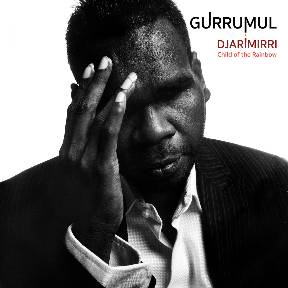
Gurrumul – Djarimirri
Gurrumul sings in his native Yolongu language
Wow. That’s pretty much it. This album is my personal soundtrack to Queen Celine and it’s a stunner. It’s deeply, sensually Australian. You can almost feel the heartbeat of an ancient country across the whole album. If you’re a fan of Michael Nyman or Phillip Glass, this ones for you. It goes best with doing broad, sweeping washes of watercolour where you’re simply trying to capture the timelessness of the sun going down and rising again each day. 9/10
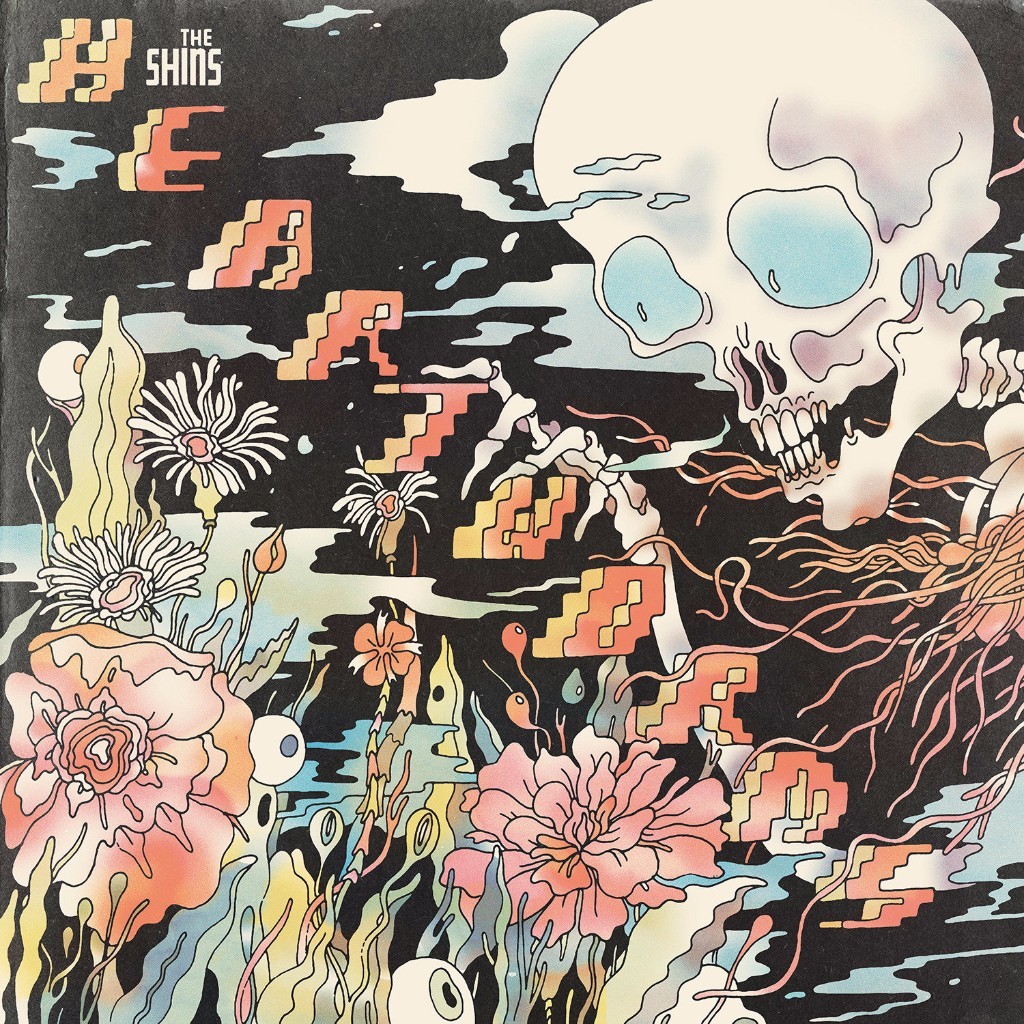
The Shins – Heartworms
Heartworms by The Shins – As sticky as an earworm
The Shins deliver another brilliant album with Heartworms. If I find myself procrastinating, I’ll turn to this one, dance around a bit and then channel that energy into getting some work done. I’ve seen The Shins live multiple times now and they never fail to disappoint. I catch myself singing all different songs from this album and all times of the day. They’re fun and sticky. So much so that perhaps it could’ve been called “Earworms” and no one would question why. There’s also a brilliant second release of these songs that have been re-intepreted by the band themselves. It’s called Worm of the Heart and it’s no less impressive. 8.5/10
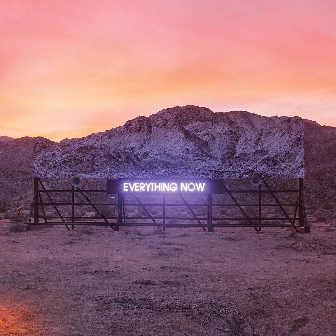
Arcade fire – Everything now
Everything Now, by Arcade Fire
I’m a long time Arcade Fire fan, but this album just hasn’t been very sticky in the studio. I’ll listen to it once or twice and then a little while later I realise the music has stopped and I haven’t missed it. Don’t get me wrong, it’s still a great album, but it hasn’t been on high rotation in the studio, especially compared to the others of late. 6/10
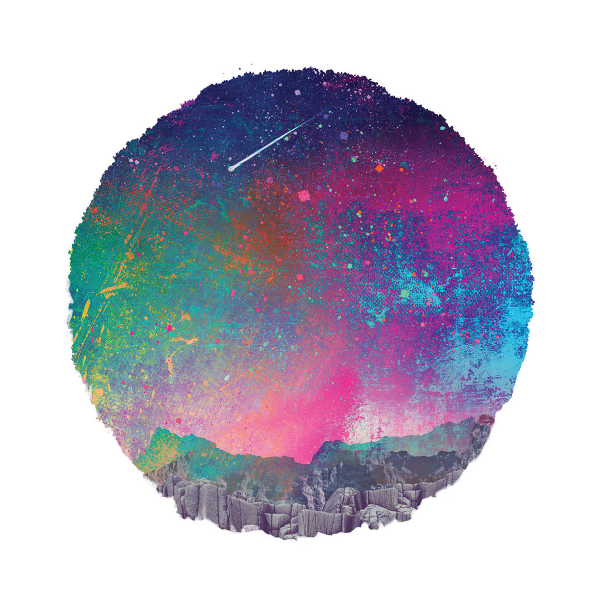
Khruangbin – The universe smiles upon you
This album is like a musical Banh Mi – a perfect fusion of East and West
Producing art is the easiest way for me to slip into a flow state. Once I get going time goes all elastic and the rest of the world melts away. I’m discovering that artists like Khruangbin help with this. This album has been on repeat since I started Koala Bare over 12 months ago. Playing a genre of music that was born from the US Military’s occupation of Vietnam, Khruangbin makes tunes that have flavours of the east, supported by sideplate of classic american rock. I HIGHLY recommend giving them a listen but be sure to be in a safe place in case you end up in a state of hypnosis. 8/10
After 5 or so years of painting with watercolour, I’ve spent A LOT of money on paint. Some have been a brilliant investment, while others sit in the draw. There are some tubes that have only a few millilitres used and I’m unlikely to go to them any time soon. The problem is, I love colour, it’s seductive and exciting. I rarely leave a trip to the art store without another tube to try. But when it comes to watercolour paints, I’ve finally settled on a core set that’s great for my two main purposes: work in picture books and painting outdoors (also known as en-plein air painting).
Because colour is literally infinite, it’s important to be clear on why a colour is “in” and “out”. The ins and outs reasons described here are very personal and it’s likely that everyone will value different things in their paints. Here’s why these are the ones I trust:
For what I paint, I can make close to any colour with these 11 pigments
The mixes of each produce very reliable effects
They are all single pigment paints which helps provide luminosity to the work
They are ALL extremely lightfast which means if I sell anything, the buyer gets something that will last for a long time.
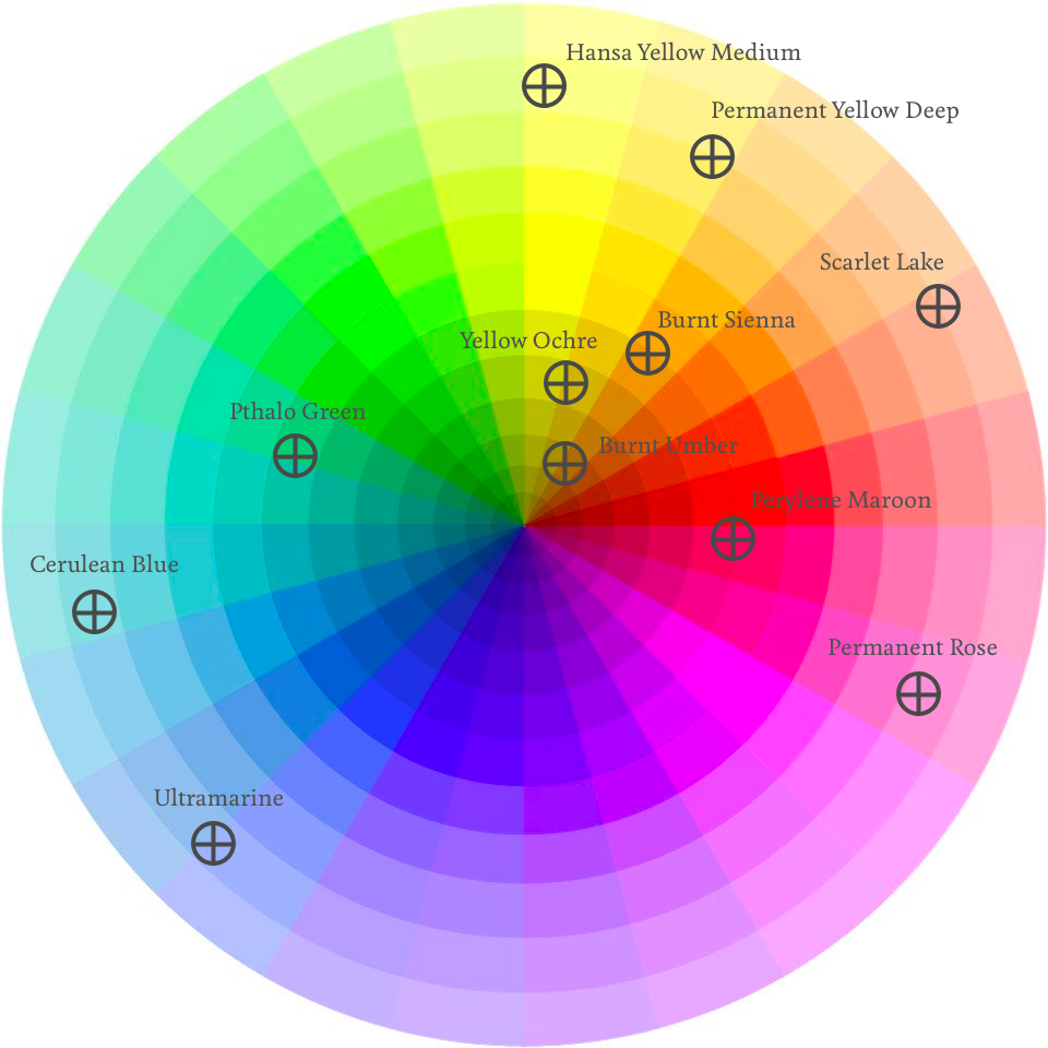
Here are the colours mapped on to the colour wheel
Brand
Name
Number
Notes
Daniel Smith
Hansa Yellow Medium
PY97
A bright versatile mid yellow. It mixes beautifully with a whole range of blues and reds.
Daniel Smith
Permanent Yellow Deep
PY110
When it’s diluted, it’s a sunnyside up egg yolk. But when it’s thick and buttery, it’s the dark yellow/orange of a hard-boiled egg yolk
Winsor and Newton
Scarlet Lake
PR188
I inititally found it difficult to like this colour, until I learned how to use it.
Daniel Smith
Permanent Rose
PV19
My pet name for this colour is ‘blush’. It’s perfect for pink cheeks.
Daniel Smith
Ultramarine
PB29
The most versatile and used paint in my palette.
Holbein
Cerulean Blue
PB36
Most useful for skies. It’s a sunny blue that’s also great for shadows in white clothing.
Daniel Smith
Yellow Ochre
PY43
Technically not ‘real’ yellow ochre but who cares right?
Winsor and Newton
Burnt Sienna
PR101
If I’m painting landscapes, I use the less orange alternative PBr7
Daniel Smith
Burnt Umber
PBr7
A most delicious brown. It’s like painting with chocolate
Daniel Smith
Perylene Maroon
PR179
Most people use Alizarin Crimson, but this alternative is so much more lightfast
Daniel Smith
Pthalo Green
PG7
I use this VERY rarely, mainly when I’m lazy. It makes the blackest black when you mix it with it’s exact complement, PR179
I’ll write a bit more about each in-depth later, but for now:
Hansa Yellow Medium (PY97)
There’s not really that much to say about this pigment except it’s a nice primary yellow and because of this, very versatile. You can make some beautiful oranges if you mix it with reds and VERY bright greens if you mix it with the right blue. On its own, it’s perfect for bright sunny days.
Permanent Yellow Deep (PY110)
BOY did I fuss over getting this one nailed down. It was actually one of the first pigments I ever bought but I spent so much time messing around with ‘orange’. I tried Pyrolle Orange, but it just doesn’t mix as cleanly with some of the other colours I have. I also tried Nickel Azo Yellow, which is duller, and, well, just ‘less orange’. Nickel Azo is still one of my favourite colours, but in terms of a flexible colour palette, nothing goes past Permanent Yellow Deep. New Gamboge came close but I like to stick with single pigments, and New Gamboge is a mix between two different ones.
Good alternatives depending on your needs: New Gamboge, Nickel Azo, Pyroll Orange
Scarlet Lake (PR188)
Scarlet Lake was in my first watercolour set but it never looked ‘red’ enough for me. It loses a lot of saturation as it dries. I went out on a limb and bought a Pyrolle Red to see if that changed my opinion. And, well, Pyrolle Red is gorgeous, it’s perfect fire truck red, but I just couldn’t get the luminosity in my mixing in the way I can with Scarlet Lake.
Permanent Rose (PV19)
Ok, so technically this isn’t red, but by golly isn’t a gorgeous pigment. Mix it with a dash of yellow ochre for a lovely skin tone, or let it mingle with ultramarine for a perfect purple. I don’t carry a purple pigment because it’s too much fun seeing how Permanent Rose and Ultramarine make magic on the paper together.
Ultramarine (PB29)
Yikes, this colour deserves it’s own post! It’s by far the most useful colour for anyone, ever in watercolour. No matter which other blog or site you look at, this will be an absolute staple in every person’s palette. In fact, you could literally run with this blue and no other if you really wanted to, it’s that good.
Cerulean Blue (PB36)
No matter how many cool blues I try, nothing gets me quite as much as this Cerulean by Holbein. It’s the only Holbein I carry and I dare say that if I was painting more natural landscapes, a Cerulean Chromium from Daniel Smith or Manganese Blue Hue from Daniel Smith would suit better. But when it comes to painting summer skies for picture books, Cerulean is my go to.
Pthalo Green (PG7)
I don’t really need Pthalo Green, but I keep it on my palette anyway, for when I’m lazy. Even without it, I’m confident now that I can mix any green I need. But, it’s got this secret magical power. When you mix it with Perylene Maroon (it’s exact complementary (opposite) colour) you get the blackest black you’re ever likely to be able to find. I don’t often like mixing black (or using it at all) but sometimes, on very special occassions, it’s nice to be able to make it when you need it.
Perylene Maroon (PR179)
There’s probably only one place on the internet where the recommendation is to avoid Alizarin Crimson. EVERYONE still uses it, well, at least they say they do. But Bruce McEvoy of Handprint recommends giving Perry (my pet name for this pigment) a try and I’m so glad I did. It’s quite simply luscious. If you need red velvet curtains? Ask Perry. If you need the blackest black you can ever make, introduce Perry to Pthalo Green. It’s not an everyday pigment for me in the book illustration work that I do, but for landscapes, it’s a delight to work with.
Whilst I can get pretty close to hitting these colours with certain mixes from the others, I find the earth triad really just so pleasurable to work with. Everything from sandy beaches to the dusty red Australian soil, the combination of these three workhorses bring me an instant pleasure. And isn’t that what painting is supposed to be about?
And that’s it…
Well, I’m always experimenting with different pigments but they’re really expensive and so to save money, the best thing to do is learn how to colour mix properly. There are other pigments I use for special occassions of course, like Indanthrone Blue when I need a nice pure navy, or Manganese Blue Hue for meditteranean waters. But overall, there’s a reason ‘split primary’ is a well-known colour setup. So, now I’m off to do some mixing.
People ask me, ‘Where do you get your ideas?’ And, like most writers, I have the standard answer, “From life.” But I know it’s not a good answer. It’s vague, unhelpful, and to be honest, a bit of a cop-out. A better answer would be, “It’s complicated” or “I actually don’t know”. But that’s also unhelpful although slightly more accurate. It’s challenging to try and unravel where they really do come from. Every project and story is different. There’s no formula. When I hit on an idea, it’s often a surprise to me too. What I do know is that most people don’t have the time or attention span for me tell them the whole answer. Here’s a short version of the things I currently believe to be the biggest influence on where I get ideas.
Input happens constantly
I think of every second of life as ‘input’. The thing I ate for breakfast, the people I saw on my commute, the pigeon that pooed on my shoulder today. Every sound, image, or feeling that enters through my senses, whenever I’m doing anything, ends up in my brain.
Most of the time, I’m not remotely aware of the sheer volume of information going in to my brain but it’s there because I find it at the most unexpected times.
Like most people, I don’t consciously remember every little thing I saw, said, did, or smelled. But it’s there. I know it’s there because I remember things I don’t even know I remember at the weirdest times. For example, I couldn’t tell you the exact words I used when I was chatting with someone in line at a cafe yesterday. But then, years later, I’ll remember the exact conversation when something seemingly unrelated triggers it. There’s no obvious logic to what will trigger a memory, and so that makes it difficult to codify and teach. Our brains are phenomenal at taking in and storing information. Most of the time, we’re not aware of what’s going in.
Timing is critical but serendipitous
The sequencing of events is influential in how my brain decides to mash things together at any given moment. These events don’t have to be linear, or even close to one another. Again, it’s pretty illogical and often, multi-sensory.
I might experience a taste as an adult. For some complicated reason (I’m sure a neuroscientist could expand on that), it triggers a memory of an old neighbourhood dog I knew when I was eight years old. The thought of the dog reminds me of a noisy neighbour who used to talk too loudly but cooked the best chicken schnitzels I ever ate. And then, yep, you guessed it, there’s an idea for a crazy chef who runs out of chicken and engages the help of a dog to go on chicken hunt adventure.
As terrible as that idea is, I think it demonstrates an important aspect of the way our brains work. The basic idea is that every brain is full of ephemera, and it’s a jumble. Sounds a lot like ‘life’, right? At least with life, there’s a definite beginning and end.
Paying attention to yourself is important but difficult
These random memory triggers and weird convoluted connections between illogical events happen to me all the time. I’m sure they happen to you too. Our brains are not very different after all. So, I can only postulate that maybe the difference between me and people who ‘don’t have ideas’ is they don’t notice when it happens? The art of noticing takes work and practice. I plan to help with that in this journal over the coming months because there are definite tools and techniques for building this idea-catching muscle in yourself.
So yes, ideas come from life, and life is complicated. The real question we should be asking isn’t “Where do you get your ideas from?” It’s “How do you notice and idea and decide on which one to explore further?” THAT is much harder, and it’s the subject of a whole other post.
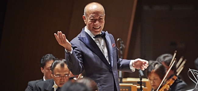
I’ve always been a fan of live music. I spent much of my early twenties going to pub bands and watching people ‘rock out’ on stage. But I very rarely think, “Hey, I should go see some classical music.” And that’s not because I don’t like it. I listen to quite a lot of in fact. But attending a live symphony is just not something that sits in the front of my mind. Based on my recent experience, it probably should.
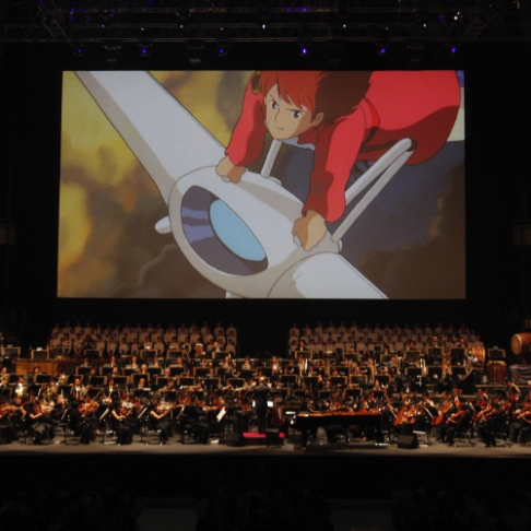
My wife and I recently went to see “Joe Hisaishi in Concert: Music from the Studio Ghibli films of Hayao Miyazaki.”
There’s SO much to talk about from this experience. I could spend hours exploring the long-standing and marvellous collaboration of Hisaishi and Miyazaki – a perfect match of sound and vision. Or I could wax lyrical about the impact of Miyazaki’s storytelling – his influence on the way I tell stories. But for now, I want to focus on the orchestra.
I was struck most by the incredible power of a group of humans so in sync with one another. I was literally overwhelmed.
There were several moments of the performance that moved me so thoroughly that I had chills down my back and tears well up in my eyes. That doesn’t usually happen to me. Ever. I couldn’t help but ask myself why.
It turns out that sitting in that auditorium, listening to a group of humans dedicated so wholly and entirely to their craft, all moving in sync, contributing to a broader goal and achieving it spectacularly is a pretty privileged and moving experience. Sounds obvious, right?
Guided by this most iconic Japanese artist, the orchestra was such a shining example of how connected human endeavour can result in something beyond any individual achievement. It’s a thing that can ONLY be achieved through mastery at all levels. At a personal level, the musicians are clearly masters of their craft. And at a tribal level, the shared understanding of everyone’s place in the tribe and their willingness to contribute to making something greater than themselves.
I rarely process experiences as profound as this immediately. It was difficult to describe to my wife what I was feeling at the time. As we walked out of the theatre, I just kept harping on about ‘hopefulness.’
For me, Hisaishi’s music exudes hopefulness. It’s a feeling I get after every Miyazaki movie. That the world isn’t as cruel, or inevitably doomed as the media leads us to believe. And Hisaishi did it to me again. But this time the feeling of hope that I got from the music was paired with some surreal sense of being alive. A feeling of being a part of something. I just couldn’t put my finger on it at the time.
I wasn’t up there with 100 musicians. In fact, I’ve never collaborated with 100 people simultaneously on anything. But the experience and the days afterward have me thinking about our species and humanity again. A reminder that we’ve all got our own instruments, the ones we refine over the years of our life. It truly helps to consider our smaller place in the bigger picture. We contribute in our own way to further the tribe, just like different sections in an orchestra. Each piece is needed for a fuller, more luxurious experience for all.
So this is what I’ll take away from a night at the symphony – that the world isn’t that bad, there’s hope for us. And I’ll do my darndest to make life a bit better for all, even after I’m gone.
I’ve been working hard to understand language since I started writing for children. And while I ‘studied English’ in school, the focus was teaching you to communicate, not on how language can make you feel.
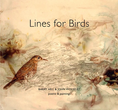
Lines for Birds, Barry Hill and John Wolseley
I was browsing a bookshop in Alice Springs on a recent trip to Central Australia when I came across this book – Lines for Birds by Barry Hill and John Wolseley. I picked it up in-store to have a browse, and there was something inside me that wouldn’t let me walk away without purchasing it. Here’s just sample of one of the poems that made my heart dance a little when I read it.
Painted Finch
Yes, and the painter did this –
touching the throat up crimson
blood-spotting the tail.
That dusty khaki coat
protecting its quivering back
ever ready for bivouac.
In the bunker of spinifex –
chunky-beak stamina
a salt and pepper attack.
Its breast, its belly
is porous with white dots
speckled with fragility.
Pecking life, pecking death.
It’s a gorgeous book in every sense. Two accomplished artists set off on a journey from the Victorian Mallee to the forest of South East Asia. They spent time with one another and captured birds in their chosen art form. Hill uses words and Wolseley uses pictures. Both are masters of their craft.
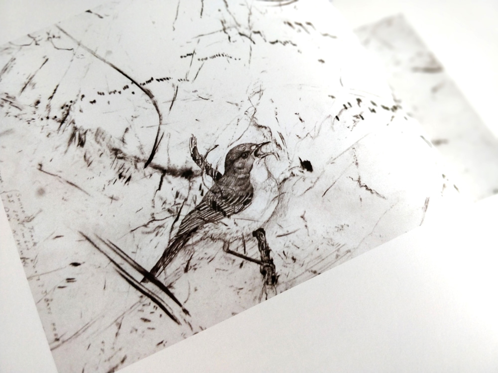
White Throated Gerygone, 2008 – Wolseley
Like most poetry books, this isn’t one to read from cover to cover in a sitting or two. It occupies a convenient place in our home so when the mood strikes, I can leaf through to a random page and simply enjoy feeling language.
Geese on the wing
Never quite ready to take off: too heavy.
Their masks too thick, or plastic wrapped.
And then, even when aloft
the yellow feet hang out of a cooking pot.
The effort to climb up, above
their cloddy sounds, is mammoth.
Their flight paths break apart
are silhouettes in a wreckage – no music
to speak of: it’s so slow
disorder akin to flood.
The book has 6 sections, each is a unique habitat. In Scrub Land we see and hear Zebra Finch and Bush Curlew. In Forest, we witness a stunning Olive-backed Oriole Eating Pawpaw. This painting by Wolseley was the catalyst for the book. It began when Hill responded to the painting in Wolseley’s 2001 exhibition, Tracing the Wallace Line.
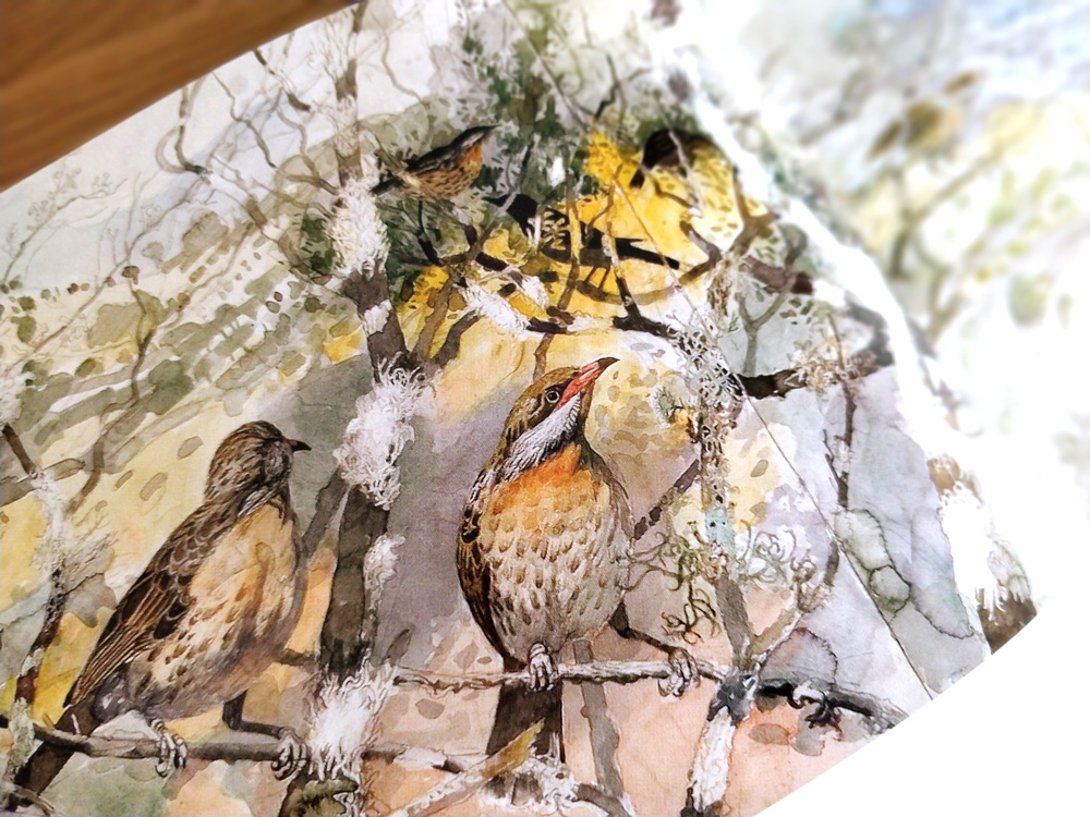
Song of Sea, Sand and Salt, Monebeong (detail), 2006 – Wolseley
As I’m new to poetry, it’s odd for me to pick up a poetry book in-store and simply know that it’s for me. But maybe that’s sort of the point, especially with poetry. It’s beyond reason, like when you hear a song that ‘just grabs you’.
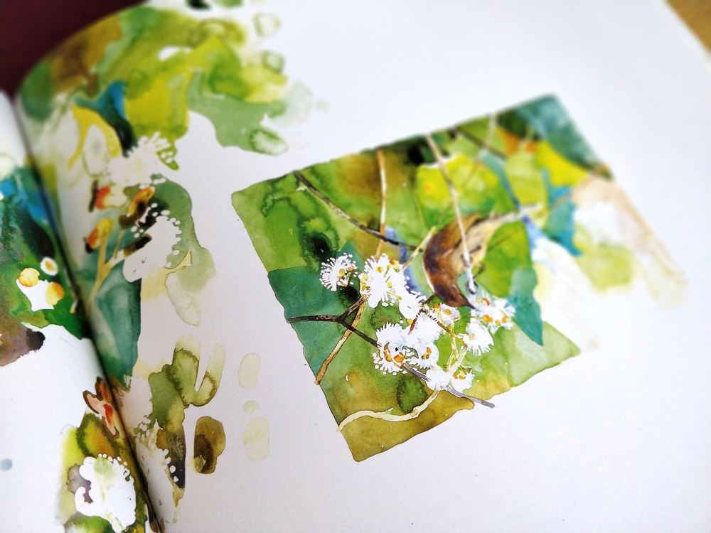
Lichmera indistincta, Baniyala 2009 – Wolseley
I’ve got a keen interest in birds which, given the subject matter, probably helped my decision. I’m still dipping in and out of this book almost a year later. I feel like I’ve only just begun to sense the depth that these two artists are able to reach as they collaborate with each other in this way. I’ll be posting some favourite snippets here and sending out some updates to new finds in my newsletter in the coming year. But don’t let that stop you picking up a copy for yourself. If you or someone you know likes language, birds, or visual art, I’m not sure they couldn’t enjoy this at some level.
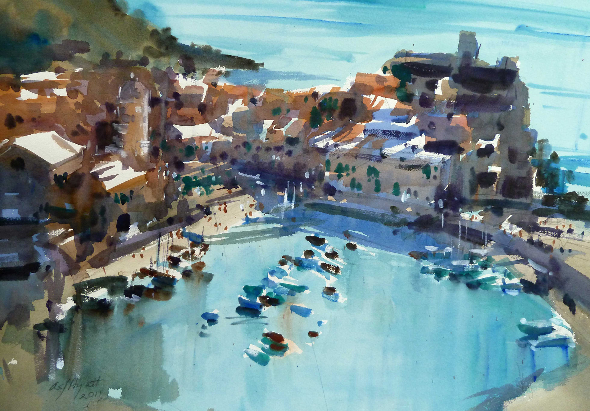
I spend a lot of time studying fine art watercolour artists who are doing some of the most incredible work you’re ever likely to see. When I was just starting out, my wife bought me a ‘Masterclass’ with this lady I have never heard of. I had no idea who she was or what she did. But after a quick Google, I was smitten with Amanda Hyatt.
Those blues! Amanda Hyatt paints Rio Maggiore and it feels like I’m there.
Why do I like her work? If you watch the video above, you’ll see how loose she is with applying the paint. Her touch is exquisite, her ability to capture the impression and light in a place is something akin to a magician for me. I took away a couple of really key points from her workshop that has stuck with me ever since, and you’ll probably see them in my work if you know what to look for.
Never clean your palette, it’s a recipe for disaster. Now, from a fine art perspective, I agree. Being able to shift colours to warm or cool while keeping them unsaturated is incredibly useful if you’re trying to capture realism. But for illustration, especially in kids books, sometimes you need that pop of a pure, clean colour. So whilst this advice is incredibly useful and insightful, something that would take years to learn, sometimes it’s OK to ignore it, as long as you’ve got a good reason.
Glazing is magical and a perfect way to tie elements of a painting together. I learned so much from watching Amanda glaze paintings. Her deep understanding of the transparency of the paints she’s using is evident in every stroke. The way she slaps on Ultramarine over completely dry passages of work is shocking to witness but she knows exactly what she’s doing.
The results are stunning. Watch the video below to see how she does it.
I think attending art workshops is a great way to witness different painting techniques. In the end, it’s not about copying these masters, trying to mimic everything that they do so you can ‘paint like them’. It’s really about getting a flash of inspiration and learning just a couple of things that have a deep influence on the way you continue your own art practice.
Competition has a lot of benefit. History is littered with examples of how rivalry pushed humans to achieve more in a shorter time. This is great if faster and ‘more’ are your goals. But not everyone needs to be faster, or make more.
I scroll through my algorithmically-driven Instagram feed maybe once every few days. Most of it is art – Artists posting their work. I find Instagram useful for exposing myself to new materials, tools and techniques that I would otherwise not see. It’s like an online art gallery where I can walk around and just take it all in for a while.
Like in an art gallery, many of these artists are FAR more experienced than me. I mean, like, 20 years or more. They’ve got better technique and a life time supply of content. This means they post a new item pretty much every day. And so, every few days, when I walk through this gallery, the effect it has on me will depend on how I’m feeling. If I’m feeling as though I’ve been ‘productive’ for the day, I’ll ooh and ahh over their feeds. But, if I haven’t, the opposite is true (and it’s much worse), I get overloaded with guilt. I should work harder, paint more, sketch everyday, try a new medium, experiment more, write more, try poetry, and on and on it goes.
Instead of these incredible artists fuelling a fire of inspiration, it piles on overwhelm. And overwhelm breeds stagnation. I feel stuck. What am I supposed to prioritise? Should I post looser sketches so I can post more often? Should I have a more targeted marketing strategy? Should I just go deep on an idea and ignore it all? What am I supposed to do next?
And then I close Instagram.
It takes a day or two of sitting with my own thoughts before I begin to do something. And it always happens to be something that makes me feel good at the time. Sometimes I have a few days of poetry where I write about people I see on public transport. Other days, I’m so immersed in a novel I read. Sometimes I’ll take a pen out and sketch a tree that I find particularly interesting for some reason. I walk a lot. And, inevitably, new things arise. Perhaps I hit on a new story idea, or a new character. Perhaps I stumble across a new colour combination I’ve never tried before. No matter how ‘pointless’ these whims feel at the time, it turns out that every single bit of of creative effort isn’t wasted. It’s contributing to a bigger picture. In 20 years time, it’ll be called a life’s work.
Every single bit of of creative effort isn’t wasted. It’s contributing to a bigger picture. In 20 years time, it’ll be called a life’s work.
But, this happens SO slowly. Frustratingly so. And it’s only frustratingly slow because I sit in my little Instagram bubble and compare myself with everyone else who seems to be going much faster than me. Instagram is FULL of people producing stuff, constantly, across mediums and styles that are too diverse for my poor little brain to cope with. When I look at this collection of work in the largest art exhibition on the planet, it feels like I’m slow, too deliberate, lagging behind.
But the reality is I’m working really hard. Like many artists, I have a day job that goes from 9-5. When you factor in commutes to and from the office, meals and sleep, that leaves a couple hours a day for ‘something’. And so I use that time, ferociously.
See, what I know to be true now is that there’s no competition in art. Yes, there are awards, and exhibitions, and how much money pieces are selling for, but that’s not art. That’s business.
A while ago, I started the following practice. Every few months, let’s call it 6, I look back at MY old work. I look to see how far, if any, I’ve come. If I’m NOT seeing flaws and mistakes in it, it’s a problem, but that hasn’t happened yet. Life happens, time changes you. Yes, there’s the rote practice of wielding a brush, but time makes some things more important than others. It changes priorities. What’s interesting today isn’t so tomorrow. And that’s not a bad thing.
If creative work is a lifelong pursuit and your expectations of what you will produce are always ahead of your technical ability to produce them, you don’t need external competition to drive you. Your only comparison is yourself.
So keep old work, don’t throw it in the bin, maybe lay off Instagram for a while. Focus on your own unique interpretation of the world. In the end, it’s the world that moves you to create, and we all deserve to see how you interpret it.